This report is from our student group in the Spring 2023 class 806y, Justice By Design.
American Bar Association’s Free Legal Answers: User Experiences and Recommendations
by Sonya Googins, Justin Iannacone, Kelsea Jeon, Shannon Lee, Ana Ribadeneira, Kevin Wang, June 9, 2023
Introduction
Through interviews and research on how to improve access to free legal services, our team has come up with recommendations for ABA’s Free Legal Answers (FLA). Given that the ABA’s main objective is to improve outreach efforts for FLA, our team focused on enhancing the user’s experience with the site by boosting its accessibility, transparency, and trust. Our memo follows with the assumption that the first step to creating a strong outreach strategy is to improve the individual user experience with the existing site. That way, when prospective users eventually learn of the resource and use it, they are confident that FLA is a reliable and trustworthy source of help.
Overview: User Experience with FLA
This memo is organized through the lens of a user’s experience with FLA. We categorize this paper into four main steps:
(1) Arriving on the Home Page;
(2) Determining One’s Qualifications and Suitability;
(3) Submitting One’s Question(s);
(4) Receiving the Response.
The final section contains recommendations for data-driven next steps.

Touchpoint: Arriving on the Home Page
This section of the memo focuses on the user’s experience when they arrive on the home page. First impressions are key; you never get a second chance to make a first impression. As website designs grow more sleek and modern, we think it is critical to greet users with a landing page that is visually welcoming, functionally accessible, and aesthetically professional. With these goals in mind, we propose changes to six aspects of the landing page.
Updated Home Page Cover Image and Text
Before: Current webpage visual

After: proposed new image

The existing FLA homepage displays a photo of raised hands. We recommend updating this background image and the bold text on the homepage. Regarding the background image, users during our interviews reported that the main page image of the raised hands could use updating; and we agree. We created a mock-up of a new homepage cover photo that emphasizes the strength of the previous cover photo–an emphasis on diversity and a message of being welcoming to all, regardless of background.
Hence, to maintain the welcoming feel of the site, while updating the image aesthetically, we substituted the image of the hands with a more modern image of a diverse group of people looking off in different directions for help. During our interviews with stakeholders and potential users, interviewees also noted that the bold text, “Can’t Afford a Lawyer?” seemed to suggest that the site would offer users an attorney to represent them. To avoid confusion about what FLA offers and to more clearly state the site’s purpose, we recommend replacing the text with: “Get legal answers.”
Updating the Navigation Tabs to be User-Centered
Before: The Existing Navigation Tabs

After: New Possible Navigation Tabs

Another area on the main home page that we recommend updating is the tab bar. We suggest visually updating the tabs at the top of the home page, as well as modifying some of the pages, so that users are offered more information as they arrive. The “Legal FAQs,” “User Reviews,” and “About Our Volunteers” pages, all of which are new changes that we will discuss below, will be helpful for new users who are unsure about what the site offers and whether the site is suitable for their needs. Making sure such information is available immediately will also ideally increase user retention rates. We have grayed out the “Attorney Registration” tab to signal to users that the tab is not for their purposes. This slight modification will serve to make the site less attorney- and volunteer-centric and more user-based.
Language Translation options

In an effort to better retain users of color, we recommend implementing page translation options. Many individuals who need pro bono legal help are first-generation immigrants, many of whom do not speak or read English. The languages we suggest including on the website are Spanish, Mandarin Chinese, Korean, and Vietnamese, which are spoken by large immigrant groups in the United States with high percentages of non-English speakers.
Currently, there are several online programs and browser extensions that can translate pages from the user’s end, such as Google Translate. But because translation this way requires the user themself to download translation programs, we believe it would be more accessible for those who are less technologically savvy for translation options to already exist on the page like in the example above. Making sure that translation is just a visible click away will hopefully maximize retention rates for non-English speakers. Indeed, we realize that translation options will not be useful if the legal answers that users receive are still in English.
Thus, we recommend that the ABA make a concerted effort to try to attract volunteers that can speak–and write in–languages besides English.
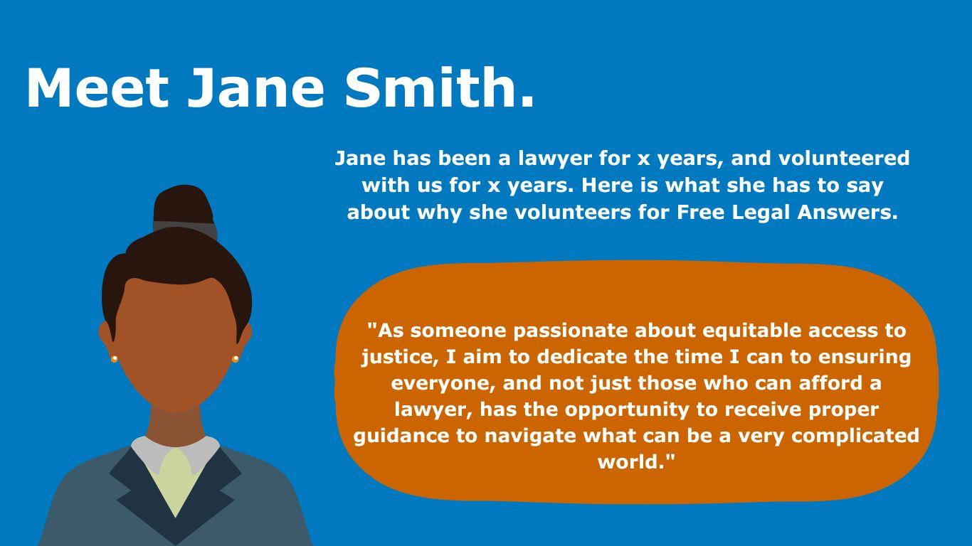
About the Lawyer Volunteers

Another homepage tab we suggest creating is a tab for our users to learn more about the lawyers who volunteer for FLA. One of the strengths of FLA–as opposed to other online resources of this nature–is that users can receive help from a real lawyer with real expertise. However, this feature is not being marketed as clearly or broadly on the existing site. Once users realize that they are receiving human-centered, individualized assistance, they might be more included to trust the FLA services as well.We suggest curating a few biographies and personas about the attorneys to allow users to get to know more generally who is on the other end of the FLA service. The following images are examples of what a new “About Our Volunteers” tab could look like.
These new features could be integrated into the “Volunteer Recognition” tab that is already on the site. On these pages, FLA could include direct quotes and testimonials from lawyers who volunteer for FLA. In these testimonials, volunteer attorneys can answer questions that users we interviewed had, such as: Who are the lawyers volunteering with FLA? Why are they volunteering? Why do they think FLA is a good resource for me to use? Personal information about the volunteer attorneys can be anonymized to protect their privacy.
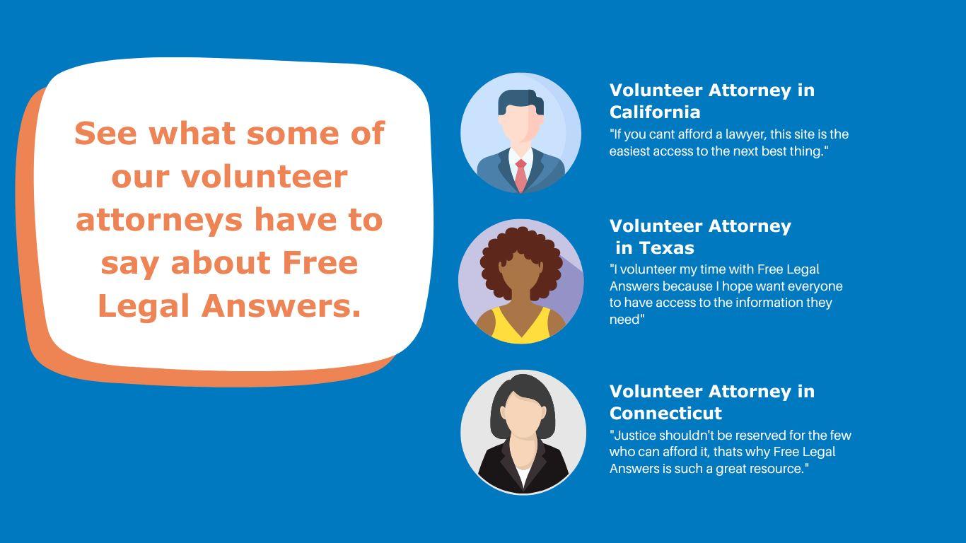
User Testimonials
Our next recommendation is to include a “user testimonials” section in a separate tab on the website. One of the most common pieces of feedback we received from stakeholders and potential users was that while the website seemed to offer an excellent service, users wanted to know other users’ experiences with the website. For instance, a potential FLA user stated that she wished she could read Google reviews of others’ experiences with Free Legal Answers.
Because first-time users are likely unfamiliar with the website, user testimonials can be one way to gain users’ trust and reassure them that this is a legitimate service that helps real people. This is especially important given that FLA is a free service, and users have often expressed skepticism about such services, thinking that it is “too good to be true.” And of course, when posting these testimonials, the information on the website can be anonymized to protect individuals’ privacy. An example of one such user testimonial is included below.

State-Specific Landing Pages
Before: current state landing page

After: proposed new state landing page

Finally, once the user gets past the home page and selects the state in which they reside, the current FLA page takes them to a state-specific landing page, which is the next page in the user’s journey. We suggest updating this landing page in three ways.
First, the “Get Started” button should be centered to better capture users’ attention as the way forward if they wish to proceed. Second, we suggest moving the “Other Places to Get Help” link into its own button on the bottom left. On the current site, the link is difficult to see—many users in our interviews did not see the link when exploring the page. Lastly, on the bottom right, we recommend incorporating a link to a new proposed feature, “Legal FAQs.” We describe the details of this new feature later in this report.
In response to potential concerns about search engine optimization, this FAQs page–or a more general version of it that is not specific to states, but can be applied to legal help and courts more generally, can also be put on the home page.
Touchpoint: Determining Qualifications and Suitability
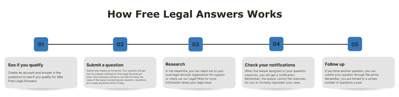
Once a user has decided that the website is trustworthy and suitable enough to go forward, the next stage is to help the user better understand how to use FLA. After a user clicks the “Get Started” button on the state-specific landing page, we propose that the page redirect the user to a new page. Currently, when one decides to “get started,” they are taken directly to a user agreement. But before that, we suggest the resource direct the user to a general overview section with information on how FLA works, how to submit a question, and how long the process takes. For instance, the current website does not indicate how long it takes to receive a response from a lawyer, making it difficult for users to have realistic expectations for how long they have to wait before receiving an answer. Providing greater transparency as to what happens to a user’s question once it is submitted will help build trust with users and allow them to better allocate their time if they know they may have to wait a set number of days before receiving an answer.
Now, after getting a broad understanding of how FLA works, the user decides to proceed with the service. They are then taken to a user agreement page to see if they qualify to use the service. The primary issue with the previous user agreement page was that users had difficulty determining whether or not they qualified to use FLA. Specifically, the biggest sources of confusion included determining whether or not someone was “low-income” and what it meant to have “low” balances in one’s financial accounts. The second issue with the previous user agreement page was that the agreement itself was too text-heavy, making it difficult for users to identify the important requirements in the agreement.
In light of these concerns, we propose two main changes. The first change addresses specific areas that users pointed out during our interviews that caused confusion when determining whether one qualified, and the second change addresses the general readability and format of the user agreement.

The above mock-up is our proposed version of the new user agreement. The areas circled in red represent new additions to the existing text of the qualifications. Below are explanations for these new additions.
First, the phrase “cannot afford a lawyer” clarifies what it means to be low-income in a way that is relevant for using FLA, because it emphasizes that an individual is considered to be low-income when they cannot afford an attorney. Although some stakeholders have expressed concern that the “cannot afford a lawyer” phrase is also ambiguous, we believe it is clear enough for users to determine whether the service is right for them. Ultimately, the ABA is balancing the desire to help those with pressing civil legal needs with concerns from attorneys who would otherwise serve clients who are able to pay for legal services.
FLA can balance both interests by asking people whether they are low-income and unable to afford an attorney. If someone cannot afford an attorney, they would not be able to hire an attorney in the first place and would thus not be unfairly taking advantage of FLA. Another reason why the “cannot afford a lawyer” qualification is preferred is because it takes into account the cost and availability of lawyers in an individual’s state. Legal markets can look very different across the country, and by allowing users to determine whether they can afford a lawyer, it allows those in the best position–users themselves–to determine whether they can afford representation. Furthermore, the requirement also implicitly recognizes that the justice gap exists not just for those with incomes close to the Federal Poverty Level, but in some areas, more than triple or quadruple that level. Thus, by associating the low-income requirement with the ability to afford an attorney requirement, FLA is increasing access to people who might have otherwise self-selected out of the process and is focusing its help on those with unmet legal needs.
Second, this proposed qualifications checklist will not replace the entire user agreement; it will simply be at the top of the existing user agreement and will be the focus of the page. While the other information on the user agreement page is also important (what FLA offers, Google Translate, about the lawyers, rules lawyers must abide by, and confidentiality), it is arguably more imperative that individuals know whether they qualify to use the service in the first place. Hence, the qualifications should be in larger print and easier to read. For users interested in learning more about the service before deciding to proceed, they can read the remaining information on the webpage.
Touchpoint: Submitting the Question
Question Intake
Once site visitors determine that they qualify for the service and want to submit a question, we propose a redesigned question intake process that immediately filters users into legal issue areas before they ask their specific question. We understand that this is a more substantive change that might be more resource-intensive than other suggestions. But this redesign addresses two important concerns. First, it addresses the FLA-side concern about not having the capacity to respond to all the inquiries that attorneys currently receive promptly and efficiently. Increasing outreach, particularly to communities of color, will only increase the volume of inquiries that FLA receives.
Second, from the users’ perspective, many of our interviewees found the question intake process to be cumbersome and, at times, overwhelming before they were even prompted to ask their question.
Our recommendation is modeled off of digital customer service platforms, particularly Amazon customer service. Amazon minimizes the burden on its customer service staff without compromising quality by filtering inquiries through prompted questions and different site branches that direct users to pre-prepared, common responses. We have a similar vision for FLA (see below).
First proposal: triage questions by high-level categories

Second part: Have people select from common languages in the broad category

Through this system, users who have common legal questions can receive immediate, verified information without having to wait for a response from an attorney. Many of our interviewees indicated the importance of receiving quality information quickly. And for users whose questions are not answered through the pre-prepared question-answer system, they can proceed to ask their question via the question submission process. In implementing this plan, we suggest FLA’s pro bono attorneys work with state and local legal aid groups to draft responses to common legal inquiries. Such responses can be informational in nature, which would not violate rules regarding the restrictions to providing formal legal advice.
This new design is ultimately more efficient and cost-effective for FLA. While it requires an upfront investment to build out the new site features and populate the site with legal information, in the long run, it will minimize the number of repeat questions and overall volume of inquiries that have to be responded to by a human attorney.
Touchpoint: Receiving the Response
Selecting Response Method
In the spirit of continuing to streamline the user experience and to eliminate unnecessary barriers to access, we propose that FLA consider giving users a say in how they wish to receive answers to their questions. As one of our interviewees noted, users should not have to create an account or log into Google merely to ask a question. In some of the stakeholder and user interviews we conducted, people expressed frustration with having to log back in to retrieve their answer. To some users, a password-protected answer on a separate platform seemed unnecessary and inconvenient.
As it currently stands, requiring users to log back in to their FLA account to retrieve their answer could create a number of issues. First, some users may simply never log back in. Second, having a password-protected service may contribute to this sense that FLA is gatekeeping access to legal advice. Many individuals find the FLA website intimidating; it is a “lawyer” website, where users are instructed not to lie, and to attest to the fact that they qualify for the service. Requiring users to formally create an account may dissuade them from using the service entirely.

As modeled in the above image, we propose that users be given the option to receive their answer by email, text, or via the FLA portal (as is the current practice). Many people rely heavily on their email and, especially for younger generations, their text messages. Allowing users to choose their desired response method ensures that legal answers are not just received but seen by those asking the questions. Moreover, adding the option to be contacted by email or by text message does not require FLA to eliminate password protection entirely.
FLA could still require all users to create an account before asking a question. And some users may still elect to receive their answer via their FLA account. Preserving the option for a password-protected response would cater to users who have particular concerns regarding the privacy of their communications with FLA. In particular, people facing any kind of violence or abuse in the home may be particularly concerned that a response to their question be kept private.
A more radical change would be to eliminate password protection entirely, so that no one is required to create an account. However, we do not recommend this practice as such an alteration may compromise the privacy of those who may not want or cannot risk having their communications with FLA be so easily viewable by others.
Auto-Reply Confirmation
After users submit their question, ABA Free Legal Answers should send users a confirmation message. This confirmation message serves two main purposes: (1) it builds trust and transparency; and (2) it empowers users with information about other resources while they wait to receive a response.

In this confirmation message, we also recommend including an estimated time frame in to help guide users’ next steps. Users will know when to expect a reply and whether to look for other resources for support and assistance in the meantime. Even if the wait time is lengthy, FLA should still include the wait time information so as not to mislead users. It is critical to provide accurate information to users so that they maintain realistic expectations with the service. Additionally, if the data does show that FLA has a longer response time, this would also be useful information for the ABA and its stakeholders to have.
However, if there is too much variability in the estimated response times to provide users with an accurate time frame, FLA can send a more general confirmation message. The message can simply acknowledge that the question was received and assure users that a response will arrive shortly. Even without an estimated time frame, the confirmation message will provide assurance to users that the FLA service is a legitimate and active service. In addition to providing assurance to users that a response is on its way, the confirmation message can also serve to educate users about other resources they can turn to while they wait for a response. Such resources can include other ABA resources, FLA’s Legal FAQs page (described in detail below), state legal aid groups, and court self-help websites. The links to the latter two resources—the state legal aid pages and court self-help resources—would not only help to facilitate a more unified ecosystem of legal help resources, but also potentially encourage the more reluctant state legal aid groups to agree to partner with FLA in their state.
By including links to external organizations, such external groups are more likely to see FLA as a supplemental resource in the broader legal aid ecosystem.
Legal FAQs

In addition to providing a legal question and answer service, we recommend FLA consider consolidating frequently asked questions across a range of civil legal topics and publishing the answers to these questions in a separate tab on the website titled, “Legal FAQs.” The purpose of this feature is to provide users with a directory of pre-answered questions so individuals can get their basic questions answered in one place. The directory may answer all of a user’s questions, or it may be a starting point so a user can gain more familiarity with a legal issue they are dealing with. On the attorney side, we anticipate volunteer attorneys will have fewer repeat questions to answer after the implementation of Legal FAQs. Attorneys will then be able to devote more time and energy to answering questions that are not already answered in the directory or questions that may include more unique personal circumstances that require greater individualized attention.
It would also help to reduce the response time for attorney answers to questions, thus making FLA a more reliable and timely service. The lower volume of questions may also give volunteer attorneys greater capacity to answer more than three questions per year for each user, which is a current limitation to the service. In addition to providing information about common civil legal issues, the Legal FAQs could also include resources to help individuals prepare for court. A salient issue for pro se litigants surrounds the mechanics behind showing up to court. In a system made by and for attorneys, non-lawyer pro se litigants could feel scared and uncomfortable navigating the legal system.
Thus, providing those unfamiliar with court “culture” with practical advice on how to conduct oneself in court, how to address a judge, and how to prepare beforehand can help equip people with information they need to advocate for themselves in court successfully. Post-Submission Survey
When a user has received an answer from an attorney, either via email, text, or through the FLA portal, we recommend FLA include a post-submission survey. FLA has used Qualtrics in the past to house a similar survey, but that survey is currently inactive. We recommend reinstituting the survey to ask users questions such as how they heard about FLA, how satisfied they are with the service they received, and how likely they are to recommend the service to a friend or family with a legal problem. To ensure that responses are as unbiased as possible, the brief survey should be anonymous. Collecting survey data would not only help FLA improve the quality of its services, but also provide data on how best to improve its outreach strategy.

Data-Driven Next Steps
In addition to our suggestions on how to improve the user-experience on FLA, we proposed three data-driven next steps that relate to outreach and resource allocation as FLA seeks to update its service.
Outreach to Specific Demographic Groups
Based on our research, which included discussions with community members as well as advocates who work in the access-to-justice space, we gathered that among the most trusted sources of information for many demographic groups, including groups who speak another language aside from English or who are people of color, are local community organizations and groups. Thus, we suggest having FLA’s local state administrators contact and partner with local organizations that are highly respected by local communities to drive traffic to the website. Religious organizations, places of worship, civil rights groups, churches, libraries, and community centers are just some examples of the kinds of organizations that could help improve FLA’s reach across diverse communities
Collecting More Data
We also suggest that FLA record a smaller sample of users (possibly two to three users) as they navigate the website. This video recording of users perusing the site would provide a window into how users are currently experiencing the website, what problems they are encountering, and how much information they are retaining. Collecting this qualitative data would provide the ABA with critical information about what is working on the site and what is not. This could also help inform next steps as FLA decides to redesign the website. With permission from the users, the recording could also be shared with the ABA’s stakeholders to advocate for greater resources to revamp the website.
Measuring Drop-Off Rates
Lastly, we suggest that FLA use Google Analytics to track drop-off rates for each page of the website. Google Analytics is a free and easy way for businesses to track how many visits each page on their website gets and at what point do users start to click out of the website. For instance, Google Analytics could show what percentage of site visitors make it to FLA’s user agreement and how many do not continue on to the next step. Such data would allow FLA to diagnose problems on the website and optimize users’ experience.