

This report is by a team of Stanford University students in the Spring 2023 Justice By Design class.
The student team was Gabrielle Braxton, Shirley Frame, Whit Froehlich, and Lavi Sundar.
The students conducted a design review and user interviews in partnership with the Eviction Legal Helpline team. The goal of the class was to identify actionable technology, design, and policy interventions to help more people find good quality legal help online.
Introduction
The Virginia Poverty Law Center’s Eviction Legal Helpline website functions as a portal for Virginia residents facing eviction to access legal information, legal aid services, and its own helpline service. This situates it within an ecosystem of various forms of renter assistance, giving it an audience that includes tenants in different vulnerable circumstances as well as attorneys and non-attorneys who volunteer their time to operate the legal helpline itself. Given these audiences, the website presents visitors with options for self-definition so that users can find what they are looking for. At the same time, particularly for tenants, its layout and content serve to establish the credibility and trust necessary to successfully convey the information and connections it has to offer.

With the gracious agreement of VPLC, we had the opportunity to evaluate the Eviction Legal Helpline website, conduct user research, and consult with experts to formulate recommendations for how to improve its format and functionality. In the sections that follow, we detail several suggestions for approaches to different aspects of the design and rollout for an updated website, including general principles, potential tools to use, and specific examples of implementations on other websites that illustrate effective applications of good website performance. These are of course only possibilities, based on the limited scope of our project, and would be undertaken subject to the priorities and resources available for such work.
Over the Spring Quarter, we built a foundation of understanding about the nature and availability of online legal help resources, then conducted interviews with model users to investigate how they navigated the website and engaged with its content. Through these interviews, we found that the site is seen as inviting and useful, but that several of its resources went unnoticed or raised additional questions. Some interviewees identified specific aspects of navigating the website that would benefit from design adjustments.
We also analyzed the site’s web presence, drawing on our research as informed by guidance from our experts. Although the site appears highly ranked in search engine results, search engine optimization is a continuous project, and comparison websites demonstrate areas for improvement in the Eviction Legal Helpline’s rankings and reputation. Furthermore, while most prospective users will likely use search engines to find the site, the search-engine status may not fully reflect the effectiveness of the site in reaching its intended audience if they are not utilizing expected search approaches, or not using a search engine to seek legal help. Nonetheless, search engine optimization remains one of the most impactful means of ensuring users find the site and take advantage of its offerings.
Please find here the link to our final presentation, or read on for our key recommendations.
Design & Content Proposals
Plain Language
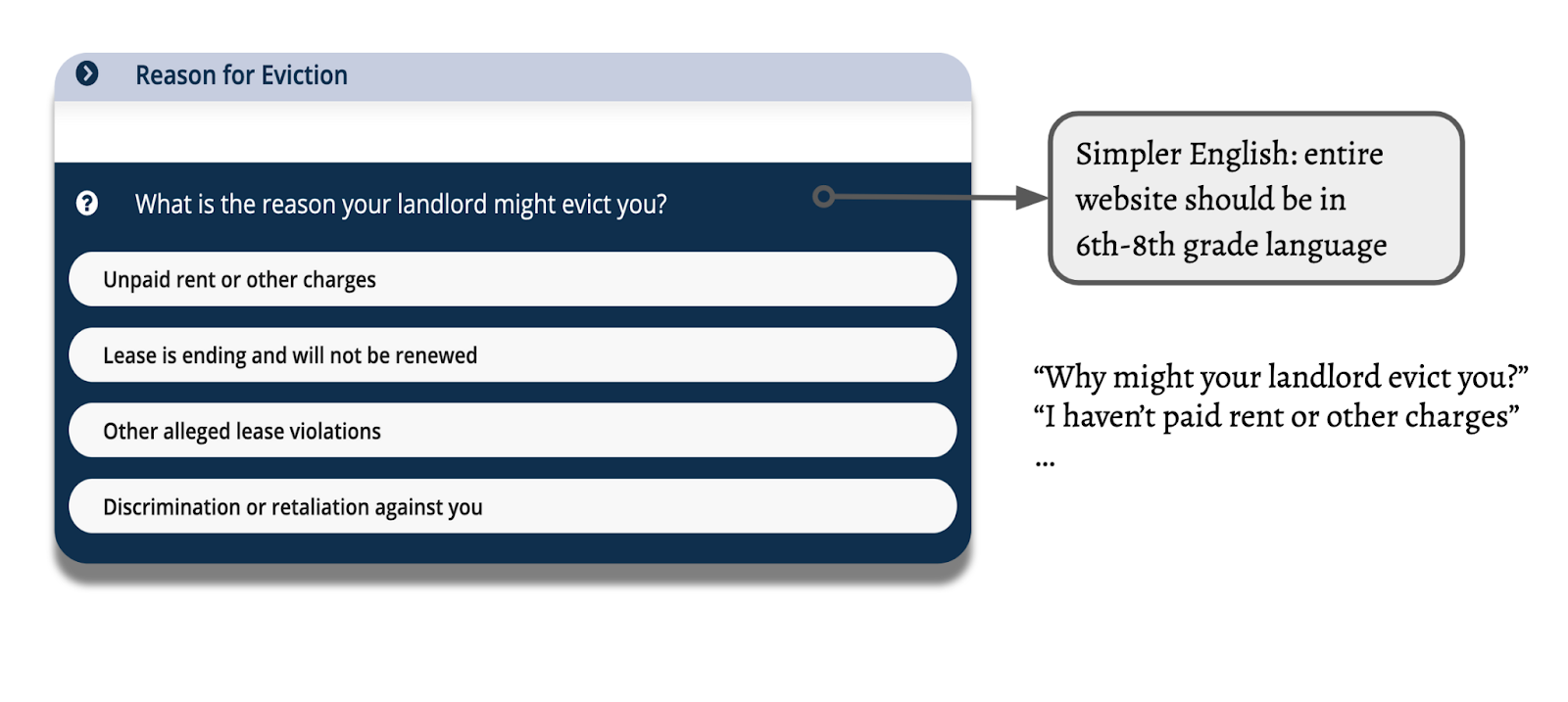
Increasing the simplicity of the language on the site will make it more accessible to everyone, including individuals with little time, learning disabilities, or limited English ability. With that in mind, we recommend writing the entire website in 6th-8th grade language. For example, this could look like updating the questionnaire with a simpler phrasing like “Why might your landlord evict you?” rather than “What is the reason your landlord might evict you?”
Simple, Straightforward Messaging
To further simplify language, reduce large chunks of texts on the homepage.
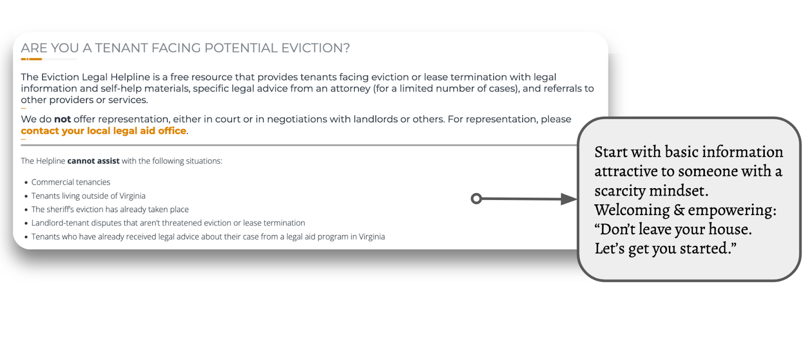
Start with basic information that would be attractive and accessible to someone with a scarcity mindset. Be welcoming and empowering: “Don’t leave your house. Let’s get you started.” Signal that there are ways to deal with this legal issue and invite users in.
Translation technology & interfaces
Moving onto translation features, the website currently presents two pages for information, one in English, “Tenants,” and one in Spanish, “Inquilinos.” This format could be confusing and redundant to users who don’t need to see the page twice—they just need the website in the language they are most familiar with. This could be streamlined with a centralized translation button. There are several models for how to implement this.
These translation and floating language switcher options are possible on WordPress with Translate Press.
Example 1: Add a translation button at the top of the page. (Website linked)
This button is easy to access and attention-grabbing, and translates the entire website to Spanish.
Example 2: Add a floating language switcher.
Our favorite option, this button is convenient and easy to see, always floating at the bottom of the page as you navigate. It stands out without obstructing the content. This particular website uses Google Translate, which reduces the manual translation labor.
Example 3: Add a drop-down menu at the top. This button format provides lots of options and is easy to navigate. Because it is stuck to the top of the page, it is potentially a little more difficult to identify but still a great option.
Mobile-First Streamlining & Navigation
Many of the users we interviewed primarily use their phones to search for legal information, especially right after encountering a legal issue. Therefore, it is important to update and streamline the website to make it easier to navigate on mobile devices. Some current challenges of the website’s mobile format are the amount of scrolling required to view photos and text boxes, where there is extra space and text, and the sidebar, which offers limited information.
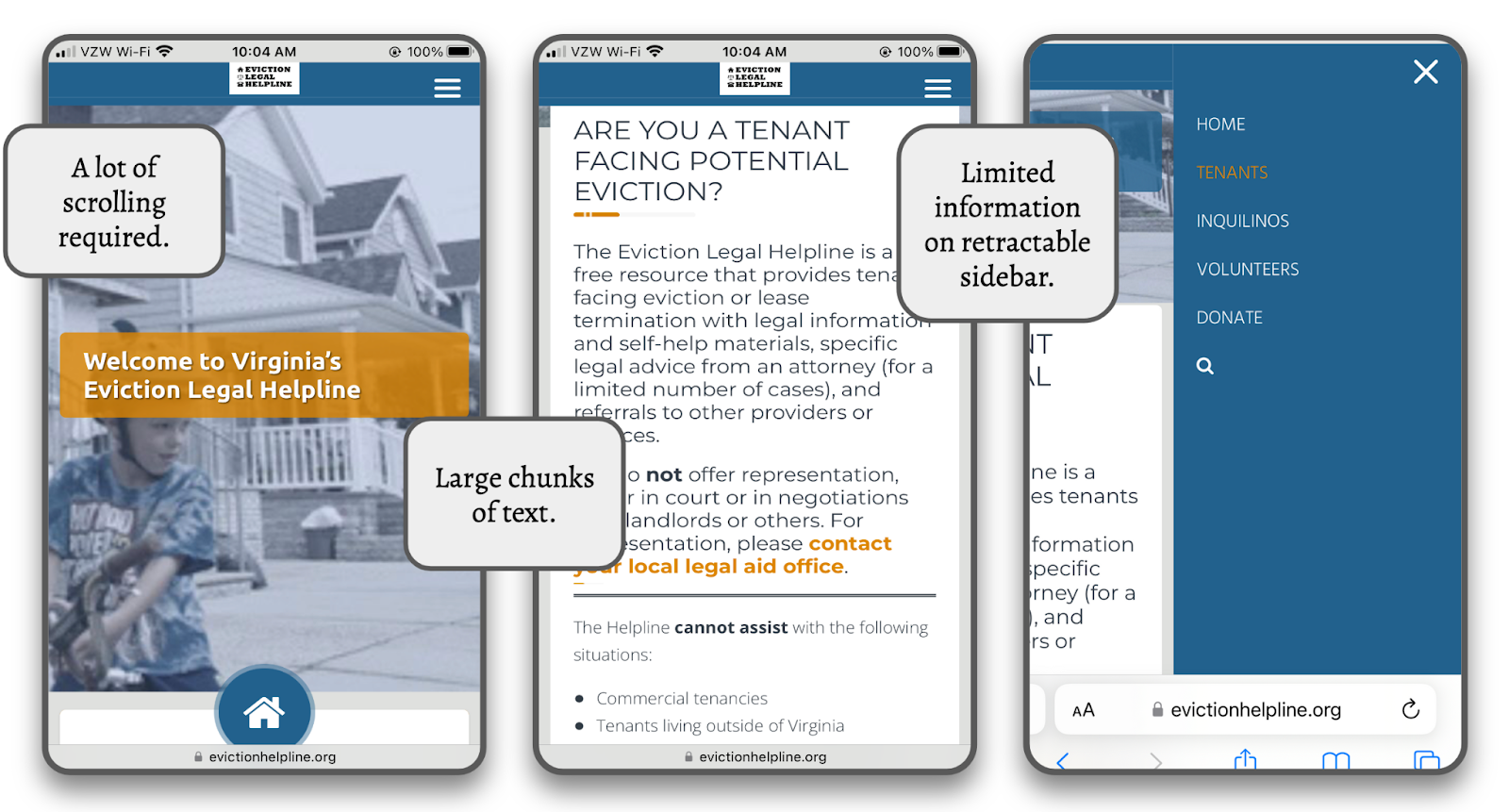
There are also some redundancies in the information offered that make navigating on a phone more difficult.
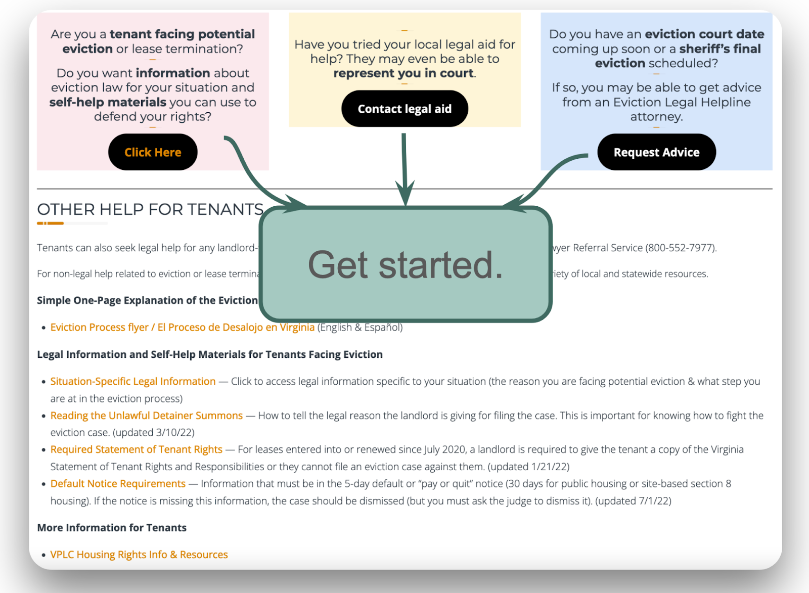
For example, on the “Tenants” homepage, several buttons and links repeat themselves, and it’s not easy to scan and understand the information. It would be useful to consolidate identical resources in a single location or prompt, such as a large “Start” button, which would then direct users to the questionnaire and, subsequently, the information they need.
Simplified example:
:
Another option is to simplify buttons by eliminating extra text. Simplified example
We recommend the following websites with great mobile formats as models and inspiration.
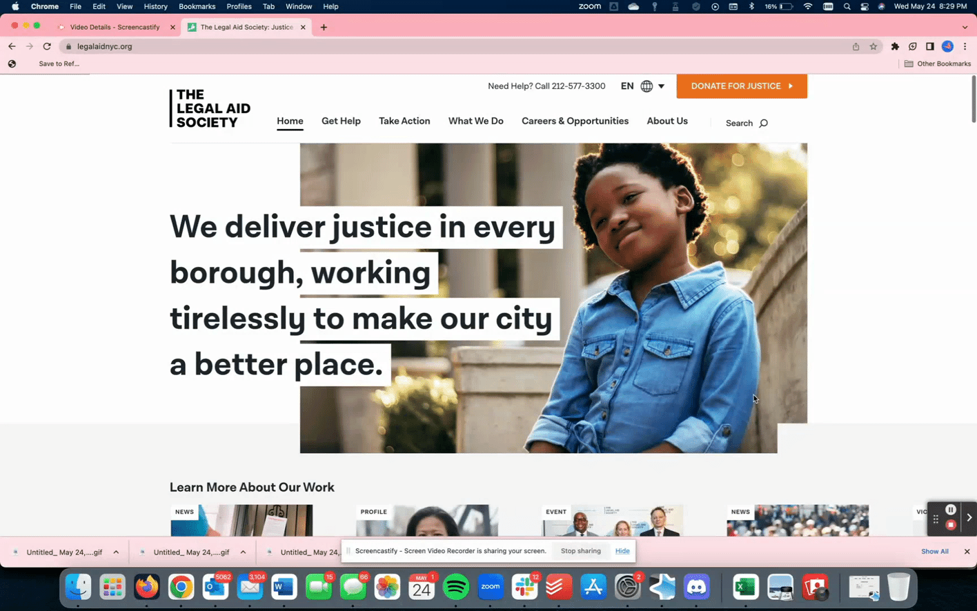
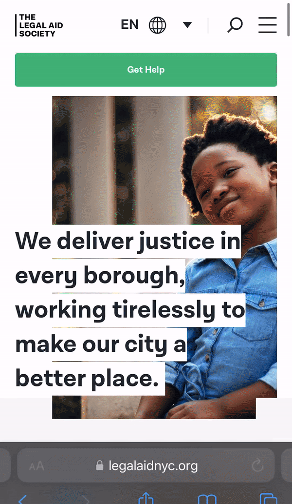
Example 1: The Legal Aid Society.
The Legal Aid Society is a great example that facilitates easy scanning with large font and bolding. It also has welcoming and well-formatted photos and a comprehensive drop-down menu for easy navigation to information.
Example 2: Ohio Legal Help.
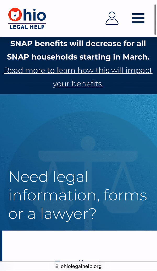
One way to limit potential overwhelm is exemplified by the Ohio Legal Help website, which relies on boxes and buttons more than a sidebar with links. There are a lot of resources & information, but the site uses icons and accessible fonts to facilitate easy scanning and navigation. One downside of this website to consider is the large number of options and buttons which could be overwhelming. In addition, there is still a large amount of text on some pages.
Considering the models from the Legal Aid Society and Ohio Legal Help, we conclude that a balance must be struck when designing mobile formats between providing detailed information and ensuring accessibility. Both the side bar and the centralized homepage with lots of buttons are good options, but the organization must weigh the pros and cons.
Redesign & rebrand the triage Decision Tree Quiz
The quiz feature on the website currently uses a multiple-choice format that may be confusing to some users. The many options may be overwhelming. During our research, we found that some users were not sure which category they belonged in, or felt that they could fit into more than one category.

This sometimes created a sense that they might have chosen the “wrong” option and may miss out on important information that could apply to them.
We suggest remodeling the quiz to a binary format to simplify the amount of information contained in each question to ensure that users arrive at the most pertinent and accurate information for their particular situation. This will also increase the user’s confidence in the information they ultimately receive.
One-Page Legal Process Summary
During our research we found that one of the most popular features on the website is the one-page summary of the eviction process in Virginia. Users liked the flowchart format and felt the information in this summary would be extremely helpful to them if they were facing eviction or experiencing housing issues.

However, most users did not find this resource without being directed to it, since the link is quite small and located near the bottom of the “Tenants” page. We recommend featuring this resource more prominently on the site. We suggest including the flowchart as an image directly on the site (rather than linking to a PDF) and presenting it to users along with the information they receive at the end of the quiz.
Having a “birds-eye view” of the entire eviction process can reassure a user who is uncertain and anxious about their housing situation, deepening their understanding of their legal rights and giving them greater agency to advocate for themselves throughout the eviction process. It may also be helpful to update the flowchart to break down the steps into groups and orient the user to key events (pre-court/post-court, service of documents, etc.).
Outreach & Discovery of the site
Having discussed formatting modifications to increase accessibility and navigability, attention must also be paid to methods of outreach. More specifically, we recommend undertaking SEO methodology in order to maximize website search traffic from interested users. Semrush, an American company that specializes in generating and distilling search engine analytics, was the primary tool used to furnish the information that we have compiled in the following portion of this report.
Authority Score
The first metric used to pinpoint areas of improvement was that of the authority score, visualized here in a polar chart.
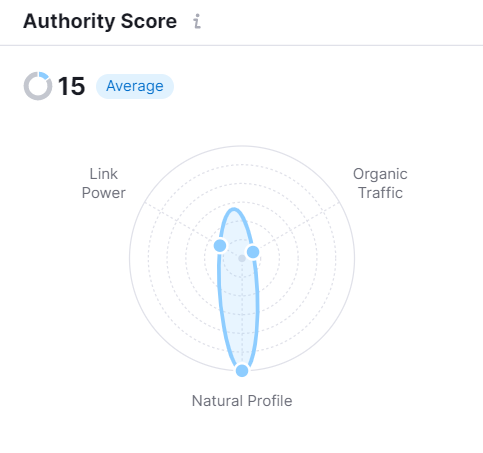
The two lowest metrics here are ‘organic traffic’, which is low, and ‘link power,’ which also is concerning.
The ‘link power’ factor is primarily a measure of the number of relevant backlinks, i.e. the amount of other credible websites that link back to VPLC’s Eviction Helpline website. A higher number of backlinks to the site would increase the site’s ranking and placement on a search results page, thus boosting user discovery and engagement.
Upon generating a list of competitor sites with similar backlink profiles to the Eviction Helpline site, the only competitor to appear was virginiahousing.com.
This was thus the best option to serve as a benchmark. We compared what domains refer to this site, to see what backlinks & referrals the site is missing out on.
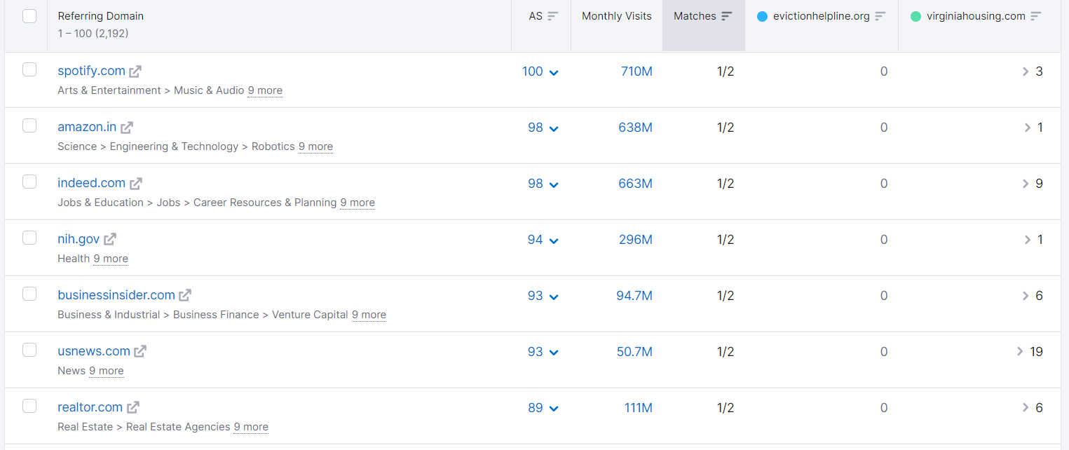
As the above report makes clear, several high-quality websites with significant user traffic – such as Spotify, Amazon, Indeed, and US News – contain links to virginiahousing.com but not to evictionhelpline.org.
Backlinks & referral strategy
Thus, we recommend that these particular sites be targeted, to the extent and capacity possible, to advertise the site or disseminate related information.
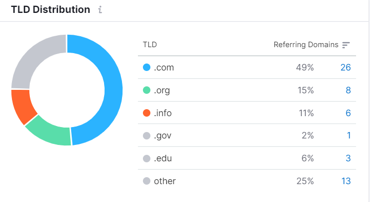
The term “top-level domain” describes the ending portion of a URL, such as dot com, dot gov, etc. The top-level domain report Semrush generated, as shown below, underlines that the majority of websites that backlinked to the competitor were dot com websites.
Emphasizing the dot gov and dot edu websites when choosing referral domains may be a useful strategy to take advantage of the increased credibility that customers tacitly assign to these top-level domains.
Keyword boosting
With the ‘link power’ factor addressed, our next recommendation aims to improve organic traffic through localized keyword boosting.
Although not all of the following keywords are necessarily applicable to the Eviction Helpline, emphasizing or increasing the frequency of the relevant ones would also serve to increase engagement with users. The website’s page titles, section headings, and text can all use the keywords that people are searching for. This will help the search engines know that this website matches people’s needs.
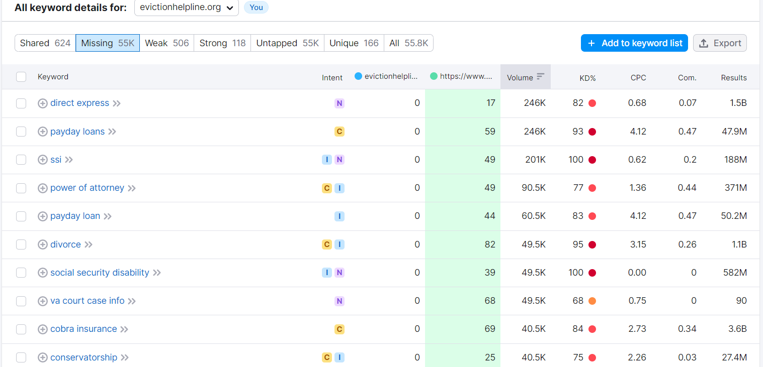
Below is an example of a keyword report the team could utilize, to find keywords that might apply to the website’s content.
Leases, Notices, and other official referrals
Another way to boost outreach is through court/government referrals and lease disclosures.
The Eviction Helpline is already featured on some government websites, such as va.gov and the Fairfax County website. However, some of the information is outdated.
We recommend updating the information on these websites to reflect the current nature of the service and making sure that any links to the Eviction Helpline lead to the correct site (these “backlinks” will also help increase SEO authority). It may also be helpful to reach out to other local websites, such as city and county websites, to include information on the Eviction Helpline.
This will boost community awareness and give VPLC greater visibility.
Court and Government Agency Referrals
Other places to feature the Eviction Helpline include Virginia’s court self-help website and the Virginia Statement of Tenant Rights and Responsibilities.
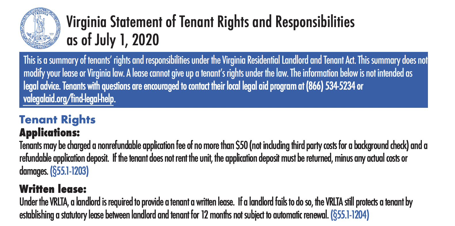
Can the Helpline be featured prominently on this official document, with the website URL, phone, and QR code?
These community websites/resources present opportunities to “triage” target users to the Eviction Helpline site. This could potentially be automatic based on the information users input (e.g., income level, issue, etc.).
Summary
The Eviction Legal Helpline is an important resource for tenants in Virginia facing eviction and a valuable project of the Virginia Poverty Law Center.
As a public-facing website, this service must balance its function as a repository of the available information and connections with visitor engagement in order to build the trust and authority to provide them. At the same time, it is important to avoid overwhelming or confusing users with misdirected or excessive content.
In order to achieve these at-times competing objectives, the website can be improved by some adjustments, depending on available resources and interest.

Following our own learning and research as part of the Justice By Design policy lab course at Stanford Law School, we have formulated the above recommendations to aid in this effort. We hope that they may help in upgrading the site to ensure that it continues to provide valuable aid to its vulnerable target populations, and that the Helpline can maintain and expand its reach.

