Are you in charge of creating a new legal help website? Or are you in the middle of a redesign of an existing one?
Then you are likely struggling with this big, unwieldy question:
How do we organize all of this legal information so that people can find it & use it effectively?
You’re likely have an information organization & design challenge. Your organization likely has a ton of content: guides, FAQs, clinics, hotlines, forms, document assembly tools, event announcements, intake forms, lookups, and more. How do you lay this all out so people can easily find what matters to them, and helps them move forward on resolving their problems?
After working on designing and redesigning legal help websites over the past decade, I wanted to share out what some of the emerging best practices are.
Here I wanted to focus in on the organization of information, and the user pathways through a website.
Thinking of legal help website users
First, orient the project around 3 frequent users of legal aid, court, and other legal help websites.
These 3 common users: the Expert Power User, Returning User, and Novice User should be at the heart of your design. I advocate for segmenting the Expert Power User off on separate channels — and then focusing most of your navigation, home page guidance, and flows towards the Novice and Returning User.
The Legal Help Website Funnel
How should you think of people’s paths through your legal help website? Especially if you are in a court system or other group with many different users, this can feel overwhleming.
For your focus on members of the public, I recommend a particular Funnel: Homepage > Problem Area> Scenario Pages. At this final node, a user gets a rich payoff of the orientation & task tools they will need to both understand their life problem in terms of the legal system, and to start taking action by either applying for services or doing tasks themselves (like filling in forms or looking up their case).
Your website should help them easily navigate down this funneled path:
From the homepage, with its many offerings, signals of authority, and different value offers to users
To the Problem Area that they are experiencing, with a landing page dedicated to that zone of problems
Then to the Scenario Area that best corresponds to what’s happening in their life. This is a separate page, framed around the life problem they’re experiencing or the goal they have.
On this Scenario-specific page, then presenting the 4 main kinds of content people need to get oriented, and start taking common tasks:
Bird’s Eye View definition and map of what the legal system has to offer to people in this scenario, including the phases of dealing with this problem
Step-by-step guide to going through these phases (most common version of people’s justice journeys, not including all of the detours and exceptions)
Service menu of which organizations (court help centers, legal aid groups, community justice workers, legal tech tools, private attorneys, etc.) can help them at which phase of their journey. What do they offer? Who is eligible and how likely are you to get served? What’s their contact info?
Forms & Form Tools for those phases of the legal process that require formal paperwork, so the Returning User especially can start doing these form tasks
FAQs, LiveChat, and Customer Service Line to get assistance for unique situations, more support if someone has limited capabilities and clarification about exactly what it all means.
If available, Case Lookup to go straight to one’s own case details and start understanding the current case process
If available, Sign Up/Intake Form for the person to apply for help services right then and there, as they are getting oriented into this space.
The website team might think about other things to feature on these Scenario pages, like videos, chatbots, slideshows, or other interactive features. But the above combination of information types & format seem to cover the main needs & intents that most legal help website users have.
Homepage strategy
Your homepage should do 2 main things. It doesn’t need to have a lot of information pay-offs (with guides and tools right there). Rather it should be about signalling authority & jurisdiction, and helping people navigate to the right zone of the website to go to.
1. Communicate the value to users
What jurisdiction it’s for (and what it’s not)
Authenticity, authority of the website
2. Quickly, clearly separate users into right path
Novice users there for help
Returning users looking for more info
Power users there for expert content
Problem-Area Landing Page
Have a home-base for the broad category of problems a person might be having, and help them figure out exactly which scenario / process fits their life situation.
Start with broadest category: Family, Housing, Domestic Violence, Traffic, Money & Debt, Court Basics, Records, etc.
Bring the person to this broad Problem-Area Landing Page & present the most common scenarios within them
Present the most common scenarios in any given problem
Using legal needs surveys or past filing data
For example, “Filing for a divorce” , “Responding to a divorce” or “I got sued for eviction” or “My rental home has bad living conditions
State the scenarios in people’s phrases, to easily match to their search queries & mental models
Provide links, forms, and shortcuts to expert content for Returning Users
Direct Novice Users to a Scenario Page, where they can find guidance
Scenario-Specific (Payoff) Page
For this given scenario, provide the user with key information, categorized as:
Quick Bird’s Eye View of Common Phases of dealing with this problem
Detailed Process steps in each phase that are the most common sequence a person can go to, to resolve this specific problem
Service Menu — who or what can help them
Not a laundry list!
Could be on spectrum of DIY to Unbundled to Full Service
Could be prioritized by most widely available right now
Make it easy for a person to see who can help them, for which process step, and which thing to contact
Forms & Form Tools laid out with both quick links
Intake or Signup form to get started seeking out human help
Case Lookup if available, to understand one’s own case details
FAQs and LiveChat to help a person understand if they’re struggling with this info
The visitors to this page are likely early in their journey & need help. Put prominent connections to LiveChat, help phone line, and more there.
In addition to this, a court help page or statewide law help page might also invest in another branch of pages: teh Forms Landing Pages.
Forms Landing Page
For any form or form tool, provide a webpage with context, instructions, and related tasks
Many people will reach this page directly from a Search Engine (or AI platform)
Explain exactly what this form is for (and what it’s not)
Have user-friendly, plain language description of form to make it more SEO-friendly
Have Schema Markup and metatags, so that search engines can find and link to this form more directly
Make jurisdiction very clear
Explain who/when they should use this. Link out to guide pages to give context
Provide instructions, videos, FAQs
Explain how to use it, how to pay for it/fee waiver, how to efile or file in person
This forms page should be a one-stop shop for a Returning User or a Power Expert User to find the right form, know the instructions on filling it in, seeing any tech tool to help them fill it in, and then knowing exactly how to file it in person or electronically.
Conclusion
I will continue to update this post as more data and anecdotes come in, about which kinds of websites best serve the different users in the public. Please let me know your thoughts, about what strategies for information design and overall website flow work best in your region.
The National Center for State Courts has a new TinyChat video that talks through online legal information strategies in the new era of generative AI. Will there be more low-quality content out there, that people seeking out legal help online will have to wade through? Will legal aid or court websites’ authoritative content get drowned out by a new wave of easily-created, but not quality-controlled articles and videos?
What does trustworthy information look like? When facing a legal problem, desperate for guidance on navigating the legal system, can we blame individuals for gravitating towards anything that appears authoritative? Will artificial intelligence (AI) help or hinder? Can the court community harness this new technology to develop useful tools? Can we modernize the court system to anticipate the influx of AI-generated documents and potentially misleading advice? How do we identify and address less-than-helpful resources before they cause harm?
These are complex questions without easy answers. However, our NCSC Tiny Chat hosts, Zach Zarnow and Danielle Hirsch, have penned an engaging story and even illustrated it using AI. Like many AI-generated creations, it may not appear perfect at first glance. Nevertheless, tune in as they discuss procedural protections, website best practices, and strategies for distinguishing reliable resources from misleading ones when individuals seek assistance.
This report is from our student group in the Spring 2023 class 806y, Justice By Design.
American Bar Association’s Free Legal Answers: User Experiences and Recommendations
by Sonya Googins, Justin Iannacone, Kelsea Jeon, Shannon Lee, Ana Ribadeneira, Kevin Wang, June 9, 2023
Introduction
Through interviews and research on how to improve access to free legal services, our team has come up with recommendations for ABA’s Free Legal Answers (FLA). Given that the ABA’s main objective is to improve outreach efforts for FLA, our team focused on enhancing the user’s experience with the site by boosting its accessibility, transparency, and trust. Our memo follows with the assumption that the first step to creating a strong outreach strategy is to improve the individual user experience with the existing site. That way, when prospective users eventually learn of the resource and use it, they are confident that FLA is a reliable and trustworthy source of help.
Overview: User Experience with FLA
This memo is organized through the lens of a user’s experience with FLA. We categorize this paper into four main steps:
(1) Arriving on the Home Page;
(2) Determining One’s Qualifications and Suitability;
(3) Submitting One’s Question(s);
(4) Receiving the Response.
The final section contains recommendations for data-driven next steps.
Touchpoint: Arriving on the Home Page
This section of the memo focuses on the user’s experience when they arrive on the home page. First impressions are key; you never get a second chance to make a first impression. As website designs grow more sleek and modern, we think it is critical to greet users with a landing page that is visually welcoming, functionally accessible, and aesthetically professional. With these goals in mind, we propose changes to six aspects of the landing page.
Updated Home Page Cover Image and Text
Before: Current webpage visual
After: proposed new image
The existing FLA homepage displays a photo of raised hands. We recommend updating this background image and the bold text on the homepage. Regarding the background image, users during our interviews reported that the main page image of the raised hands could use updating; and we agree. We created a mock-up of a new homepage cover photo that emphasizes the strength of the previous cover photo–an emphasis on diversity and a message of being welcoming to all, regardless of background.
Hence, to maintain the welcoming feel of the site, while updating the image aesthetically, we substituted the image of the hands with a more modern image of a diverse group of people looking off in different directions for help. During our interviews with stakeholders and potential users, interviewees also noted that the bold text, “Can’t Afford a Lawyer?” seemed to suggest that the site would offer users an attorney to represent them. To avoid confusion about what FLA offers and to more clearly state the site’s purpose, we recommend replacing the text with: “Get legal answers.”
Updating the Navigation Tabs to be User-Centered
Before: The Existing Navigation Tabs
After: New Possible Navigation Tabs
Another area on the main home page that we recommend updating is the tab bar. We suggest visually updating the tabs at the top of the home page, as well as modifying some of the pages, so that users are offered more information as they arrive. The “Legal FAQs,” “User Reviews,” and “About Our Volunteers” pages, all of which are new changes that we will discuss below, will be helpful for new users who are unsure about what the site offers and whether the site is suitable for their needs. Making sure such information is available immediately will also ideally increase user retention rates. We have grayed out the “Attorney Registration” tab to signal to users that the tab is not for their purposes. This slight modification will serve to make the site less attorney- and volunteer-centric and more user-based.
Language Translation options
In an effort to better retain users of color, we recommend implementing page translation options. Many individuals who need pro bono legal help are first-generation immigrants, many of whom do not speak or read English. The languages we suggest including on the website are Spanish, Mandarin Chinese, Korean, and Vietnamese, which are spoken by large immigrant groups in the United States with high percentages of non-English speakers.
Currently, there are several online programs and browser extensions that can translate pages from the user’s end, such as Google Translate. But because translation this way requires the user themself to download translation programs, we believe it would be more accessible for those who are less technologically savvy for translation options to already exist on the page like in the example above. Making sure that translation is just a visible click away will hopefully maximize retention rates for non-English speakers. Indeed, we realize that translation options will not be useful if the legal answers that users receive are still in English.
Thus, we recommend that the ABA make a concerted effort to try to attract volunteers that can speak–and write in–languages besides English.
About the Lawyer Volunteers
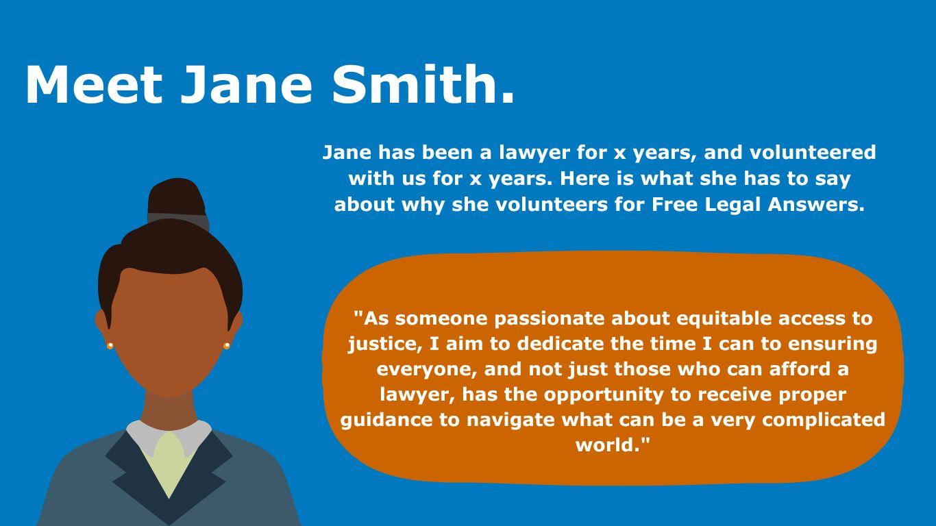
Another homepage tab we suggest creating is a tab for our users to learn more about the lawyers who volunteer for FLA. One of the strengths of FLA–as opposed to other online resources of this nature–is that users can receive help from a real lawyer with real expertise. However, this feature is not being marketed as clearly or broadly on the existing site. Once users realize that they are receiving human-centered, individualized assistance, they might be more included to trust the FLA services as well.We suggest curating a few biographies and personas about the attorneys to allow users to get to know more generally who is on the other end of the FLA service. The following images are examples of what a new “About Our Volunteers” tab could look like.
These new features could be integrated into the “Volunteer Recognition” tab that is already on the site. On these pages, FLA could include direct quotes and testimonials from lawyers who volunteer for FLA. In these testimonials, volunteer attorneys can answer questions that users we interviewed had, such as: Who are the lawyers volunteering with FLA? Why are they volunteering? Why do they think FLA is a good resource for me to use? Personal information about the volunteer attorneys can be anonymized to protect their privacy.
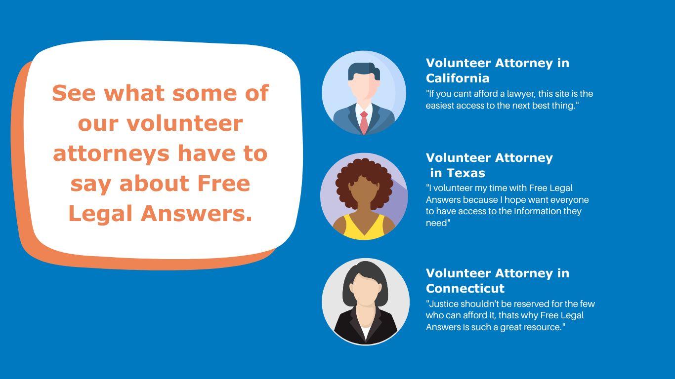
User Testimonials
Our next recommendation is to include a “user testimonials” section in a separate tab on the website. One of the most common pieces of feedback we received from stakeholders and potential users was that while the website seemed to offer an excellent service, users wanted to know other users’ experiences with the website. For instance, a potential FLA user stated that she wished she could read Google reviews of others’ experiences with Free Legal Answers.
Because first-time users are likely unfamiliar with the website, user testimonials can be one way to gain users’ trust and reassure them that this is a legitimate service that helps real people. This is especially important given that FLA is a free service, and users have often expressed skepticism about such services, thinking that it is “too good to be true.” And of course, when posting these testimonials, the information on the website can be anonymized to protect individuals’ privacy. An example of one such user testimonial is included below.
State-Specific Landing Pages
Before: current state landing page
After: proposed new state landing page
Finally, once the user gets past the home page and selects the state in which they reside, the current FLA page takes them to a state-specific landing page, which is the next page in the user’s journey. We suggest updating this landing page in three ways.
First, the “Get Started” button should be centered to better capture users’ attention as the way forward if they wish to proceed. Second, we suggest moving the “Other Places to Get Help” link into its own button on the bottom left. On the current site, the link is difficult to see—many users in our interviews did not see the link when exploring the page. Lastly, on the bottom right, we recommend incorporating a link to a new proposed feature, “Legal FAQs.” We describe the details of this new feature later in this report.
In response to potential concerns about search engine optimization, this FAQs page–or a more general version of it that is not specific to states, but can be applied to legal help and courts more generally, can also be put on the home page.
Touchpoint: Determining Qualifications and Suitability
Once a user has decided that the website is trustworthy and suitable enough to go forward, the next stage is to help the user better understand how to use FLA. After a user clicks the “Get Started” button on the state-specific landing page, we propose that the page redirect the user to a new page. Currently, when one decides to “get started,” they are taken directly to a user agreement. But before that, we suggest the resource direct the user to a general overview section with information on how FLA works, how to submit a question, and how long the process takes. For instance, the current website does not indicate how long it takes to receive a response from a lawyer, making it difficult for users to have realistic expectations for how long they have to wait before receiving an answer. Providing greater transparency as to what happens to a user’s question once it is submitted will help build trust with users and allow them to better allocate their time if they know they may have to wait a set number of days before receiving an answer.
Now, after getting a broad understanding of how FLA works, the user decides to proceed with the service. They are then taken to a user agreement page to see if they qualify to use the service. The primary issue with the previous user agreement page was that users had difficulty determining whether or not they qualified to use FLA. Specifically, the biggest sources of confusion included determining whether or not someone was “low-income” and what it meant to have “low” balances in one’s financial accounts. The second issue with the previous user agreement page was that the agreement itself was too text-heavy, making it difficult for users to identify the important requirements in the agreement.
In light of these concerns, we propose two main changes. The first change addresses specific areas that users pointed out during our interviews that caused confusion when determining whether one qualified, and the second change addresses the general readability and format of the user agreement.
The above mock-up is our proposed version of the new user agreement. The areas circled in red represent new additions to the existing text of the qualifications. Below are explanations for these new additions.
First, the phrase “cannot afford a lawyer” clarifies what it means to be low-income in a way that is relevant for using FLA, because it emphasizes that an individual is considered to be low-income when they cannot afford an attorney. Although some stakeholders have expressed concern that the “cannot afford a lawyer” phrase is also ambiguous, we believe it is clear enough for users to determine whether the service is right for them. Ultimately, the ABA is balancing the desire to help those with pressing civil legal needs with concerns from attorneys who would otherwise serve clients who are able to pay for legal services.
FLA can balance both interests by asking people whether they are low-income and unable to afford an attorney. If someone cannot afford an attorney, they would not be able to hire an attorney in the first place and would thus not be unfairly taking advantage of FLA. Another reason why the “cannot afford a lawyer” qualification is preferred is because it takes into account the cost and availability of lawyers in an individual’s state. Legal markets can look very different across the country, and by allowing users to determine whether they can afford a lawyer, it allows those in the best position–users themselves–to determine whether they can afford representation. Furthermore, the requirement also implicitly recognizes that the justice gap exists not just for those with incomes close to the Federal Poverty Level, but in some areas, more than triple or quadruple that level. Thus, by associating the low-income requirement with the ability to afford an attorney requirement, FLA is increasing access to people who might have otherwise self-selected out of the process and is focusing its help on those with unmet legal needs.
Second, this proposed qualifications checklist will not replace the entire user agreement; it will simply be at the top of the existing user agreement and will be the focus of the page. While the other information on the user agreement page is also important (what FLA offers, Google Translate, about the lawyers, rules lawyers must abide by, and confidentiality), it is arguably more imperative that individuals know whether they qualify to use the service in the first place. Hence, the qualifications should be in larger print and easier to read. For users interested in learning more about the service before deciding to proceed, they can read the remaining information on the webpage.
Touchpoint: Submitting the Question
Question Intake
Once site visitors determine that they qualify for the service and want to submit a question, we propose a redesigned question intake process that immediately filters users into legal issue areas before they ask their specific question. We understand that this is a more substantive change that might be more resource-intensive than other suggestions. But this redesign addresses two important concerns. First, it addresses the FLA-side concern about not having the capacity to respond to all the inquiries that attorneys currently receive promptly and efficiently. Increasing outreach, particularly to communities of color, will only increase the volume of inquiries that FLA receives.
Second, from the users’ perspective, many of our interviewees found the question intake process to be cumbersome and, at times, overwhelming before they were even prompted to ask their question.
Our recommendation is modeled off of digital customer service platforms, particularly Amazon customer service. Amazon minimizes the burden on its customer service staff without compromising quality by filtering inquiries through prompted questions and different site branches that direct users to pre-prepared, common responses. We have a similar vision for FLA (see below).
First proposal: triage questions by high-level categories
Second part: Have people select from common languages in the broad category
Through this system, users who have common legal questions can receive immediate, verified information without having to wait for a response from an attorney. Many of our interviewees indicated the importance of receiving quality information quickly. And for users whose questions are not answered through the pre-prepared question-answer system, they can proceed to ask their question via the question submission process. In implementing this plan, we suggest FLA’s pro bono attorneys work with state and local legal aid groups to draft responses to common legal inquiries. Such responses can be informational in nature, which would not violate rules regarding the restrictions to providing formal legal advice.
This new design is ultimately more efficient and cost-effective for FLA. While it requires an upfront investment to build out the new site features and populate the site with legal information, in the long run, it will minimize the number of repeat questions and overall volume of inquiries that have to be responded to by a human attorney.
Touchpoint: Receiving the Response
Selecting Response Method
In the spirit of continuing to streamline the user experience and to eliminate unnecessary barriers to access, we propose that FLA consider giving users a say in how they wish to receive answers to their questions. As one of our interviewees noted, users should not have to create an account or log into Google merely to ask a question. In some of the stakeholder and user interviews we conducted, people expressed frustration with having to log back in to retrieve their answer. To some users, a password-protected answer on a separate platform seemed unnecessary and inconvenient.
As it currently stands, requiring users to log back in to their FLA account to retrieve their answer could create a number of issues. First, some users may simply never log back in. Second, having a password-protected service may contribute to this sense that FLA is gatekeeping access to legal advice. Many individuals find the FLA website intimidating; it is a “lawyer” website, where users are instructed not to lie, and to attest to the fact that they qualify for the service. Requiring users to formally create an account may dissuade them from using the service entirely.
As modeled in the above image, we propose that users be given the option to receive their answer by email, text, or via the FLA portal (as is the current practice). Many people rely heavily on their email and, especially for younger generations, their text messages. Allowing users to choose their desired response method ensures that legal answers are not just received but seen by those asking the questions. Moreover, adding the option to be contacted by email or by text message does not require FLA to eliminate password protection entirely.
FLA could still require all users to create an account before asking a question. And some users may still elect to receive their answer via their FLA account. Preserving the option for a password-protected response would cater to users who have particular concerns regarding the privacy of their communications with FLA. In particular, people facing any kind of violence or abuse in the home may be particularly concerned that a response to their question be kept private.
A more radical change would be to eliminate password protection entirely, so that no one is required to create an account. However, we do not recommend this practice as such an alteration may compromise the privacy of those who may not want or cannot risk having their communications with FLA be so easily viewable by others.
Auto-Reply Confirmation
After users submit their question, ABA Free Legal Answers should send users a confirmation message. This confirmation message serves two main purposes: (1) it builds trust and transparency; and (2) it empowers users with information about other resources while they wait to receive a response.
In this confirmation message, we also recommend including an estimated time frame in to help guide users’ next steps. Users will know when to expect a reply and whether to look for other resources for support and assistance in the meantime. Even if the wait time is lengthy, FLA should still include the wait time information so as not to mislead users. It is critical to provide accurate information to users so that they maintain realistic expectations with the service. Additionally, if the data does show that FLA has a longer response time, this would also be useful information for the ABA and its stakeholders to have.
However, if there is too much variability in the estimated response times to provide users with an accurate time frame, FLA can send a more general confirmation message. The message can simply acknowledge that the question was received and assure users that a response will arrive shortly. Even without an estimated time frame, the confirmation message will provide assurance to users that the FLA service is a legitimate and active service. In addition to providing assurance to users that a response is on its way, the confirmation message can also serve to educate users about other resources they can turn to while they wait for a response. Such resources can include other ABA resources, FLA’s Legal FAQs page (described in detail below), state legal aid groups, and court self-help websites. The links to the latter two resources—the state legal aid pages and court self-help resources—would not only help to facilitate a more unified ecosystem of legal help resources, but also potentially encourage the more reluctant state legal aid groups to agree to partner with FLA in their state.
By including links to external organizations, such external groups are more likely to see FLA as a supplemental resource in the broader legal aid ecosystem.
Legal FAQs
In addition to providing a legal question and answer service, we recommend FLA consider consolidating frequently asked questions across a range of civil legal topics and publishing the answers to these questions in a separate tab on the website titled, “Legal FAQs.” The purpose of this feature is to provide users with a directory of pre-answered questions so individuals can get their basic questions answered in one place. The directory may answer all of a user’s questions, or it may be a starting point so a user can gain more familiarity with a legal issue they are dealing with. On the attorney side, we anticipate volunteer attorneys will have fewer repeat questions to answer after the implementation of Legal FAQs. Attorneys will then be able to devote more time and energy to answering questions that are not already answered in the directory or questions that may include more unique personal circumstances that require greater individualized attention.
It would also help to reduce the response time for attorney answers to questions, thus making FLA a more reliable and timely service. The lower volume of questions may also give volunteer attorneys greater capacity to answer more than three questions per year for each user, which is a current limitation to the service. In addition to providing information about common civil legal issues, the Legal FAQs could also include resources to help individuals prepare for court. A salient issue for pro se litigants surrounds the mechanics behind showing up to court. In a system made by and for attorneys, non-lawyer pro se litigants could feel scared and uncomfortable navigating the legal system.
Thus, providing those unfamiliar with court “culture” with practical advice on how to conduct oneself in court, how to address a judge, and how to prepare beforehand can help equip people with information they need to advocate for themselves in court successfully. Post-Submission Survey When a user has received an answer from an attorney, either via email, text, or through the FLA portal, we recommend FLA include a post-submission survey. FLA has used Qualtrics in the past to house a similar survey, but that survey is currently inactive. We recommend reinstituting the survey to ask users questions such as how they heard about FLA, how satisfied they are with the service they received, and how likely they are to recommend the service to a friend or family with a legal problem. To ensure that responses are as unbiased as possible, the brief survey should be anonymous. Collecting survey data would not only help FLA improve the quality of its services, but also provide data on how best to improve its outreach strategy.
Data-Driven Next Steps
In addition to our suggestions on how to improve the user-experience on FLA, we proposed three data-driven next steps that relate to outreach and resource allocation as FLA seeks to update its service.
Outreach to Specific Demographic Groups
Based on our research, which included discussions with community members as well as advocates who work in the access-to-justice space, we gathered that among the most trusted sources of information for many demographic groups, including groups who speak another language aside from English or who are people of color, are local community organizations and groups. Thus, we suggest having FLA’s local state administrators contact and partner with local organizations that are highly respected by local communities to drive traffic to the website. Religious organizations, places of worship, civil rights groups, churches, libraries, and community centers are just some examples of the kinds of organizations that could help improve FLA’s reach across diverse communities
Collecting More Data
We also suggest that FLA record a smaller sample of users (possibly two to three users) as they navigate the website. This video recording of users perusing the site would provide a window into how users are currently experiencing the website, what problems they are encountering, and how much information they are retaining. Collecting this qualitative data would provide the ABA with critical information about what is working on the site and what is not. This could also help inform next steps as FLA decides to redesign the website. With permission from the users, the recording could also be shared with the ABA’s stakeholders to advocate for greater resources to revamp the website.
Measuring Drop-Off Rates
Lastly, we suggest that FLA use Google Analytics to track drop-off rates for each page of the website. Google Analytics is a free and easy way for businesses to track how many visits each page on their website gets and at what point do users start to click out of the website. For instance, Google Analytics could show what percentage of site visitors make it to FLA’s user agreement and how many do not continue on to the next step. Such data would allow FLA to diagnose problems on the website and optimize users’ experience.
This report is by a team of Stanford University students in the Spring 2023 Justice By Design class.
The student team was Gabrielle Braxton, Shirley Frame, Whit Froehlich, and Lavi Sundar.
The students conducted a design review and user interviews in partnership with the Eviction Legal Helpline team. The goal of the class was to identify actionable technology, design, and policy interventions to help more people find good quality legal help online.
The Virginia Poverty Law Center’s Eviction Legal Helpline website functions as a portal for Virginia residents facing eviction to access legal information, legal aid services, and its own helpline service. This situates it within an ecosystem of various forms of renter assistance, giving it an audience that includes tenants in different vulnerable circumstances as well as attorneys and non-attorneys who volunteer their time to operate the legal helpline itself. Given these audiences, the website presents visitors with options for self-definition so that users can find what they are looking for. At the same time, particularly for tenants, its layout and content serve to establish the credibility and trust necessary to successfully convey the information and connections it has to offer.
With the gracious agreement of VPLC, we had the opportunity to evaluate the Eviction Legal Helpline website, conduct user research, and consult with experts to formulate recommendations for how to improve its format and functionality. In the sections that follow, we detail several suggestions for approaches to different aspects of the design and rollout for an updated website, including general principles, potential tools to use, and specific examples of implementations on other websites that illustrate effective applications of good website performance. These are of course only possibilities, based on the limited scope of our project, and would be undertaken subject to the priorities and resources available for such work.
Over the Spring Quarter, we built a foundation of understanding about the nature and availability of online legal help resources, then conducted interviews with model users to investigate how they navigated the website and engaged with its content. Through these interviews, we found that the site is seen as inviting and useful, but that several of its resources went unnoticed or raised additional questions. Some interviewees identified specific aspects of navigating the website that would benefit from design adjustments.
We also analyzed the site’s web presence, drawing on our research as informed by guidance from our experts. Although the site appears highly ranked in search engine results, search engine optimization is a continuous project, and comparison websites demonstrate areas for improvement in the Eviction Legal Helpline’s rankings and reputation. Furthermore, while most prospective users will likely use search engines to find the site, the search-engine status may not fully reflect the effectiveness of the site in reaching its intended audience if they are not utilizing expected search approaches, or not using a search engine to seek legal help. Nonetheless, search engine optimization remains one of the most impactful means of ensuring users find the site and take advantage of its offerings.
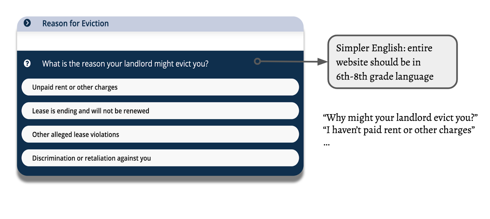
Increasing the simplicity of the language on the site will make it more accessible to everyone, including individuals with little time, learning disabilities, or limited English ability. With that in mind, we recommend writing the entire website in 6th-8th grade language. For example, this could look like updating the questionnaire with a simpler phrasing like “Why might your landlord evict you?” rather than “What is the reason your landlord might evict you?”
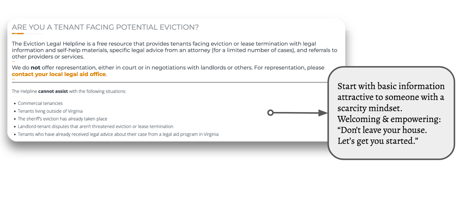
Simple, Straightforward Messaging
To further simplify language, reduce large chunks of texts on the homepage.
Start with basic information that would be attractive and accessible to someone with a scarcity mindset. Be welcoming and empowering: “Don’t leave your house. Let’s get you started.” Signal that there are ways to deal with this legal issue and invite users in.
Translation technology & interfaces
Moving onto translation features, the website currently presents two pages for information, one in English, “Tenants,” and one in Spanish, “Inquilinos.” This format could be confusing and redundant to users who don’t need to see the page twice—they just need the website in the language they are most familiar with. This could be streamlined with a centralized translation button. There are several models for how to implement this.
These translation and floating language switcher options are possible on WordPress with Translate Press.
Our favorite option, this button is convenient and easy to see, always floating at the bottom of the page as you navigate. It stands out without obstructing the content. This particular website uses Google Translate, which reduces the manual translation labor.
Example 3: Add a drop-down menu at the top. This button format provides lots of options and is easy to navigate. Because it is stuck to the top of the page, it is potentially a little more difficult to identify but still a great option.
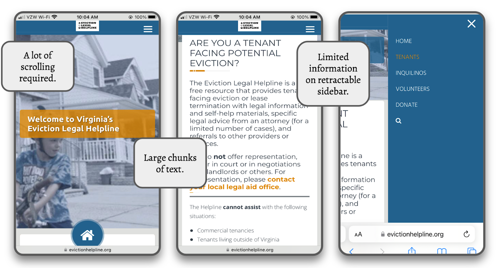
Mobile-First Streamlining & Navigation
Many of the users we interviewed primarily use their phones to search for legal information, especially right after encountering a legal issue. Therefore, it is important to updateand streamline the website to make it easier to navigate on mobile devices. Some current challenges of the website’s mobile format are the amount of scrolling required to view photos and text boxes, where there is extra space and text, and the sidebar, which offers limited information.
There are also some redundancies in the information offered that make navigating on a phone more difficult.
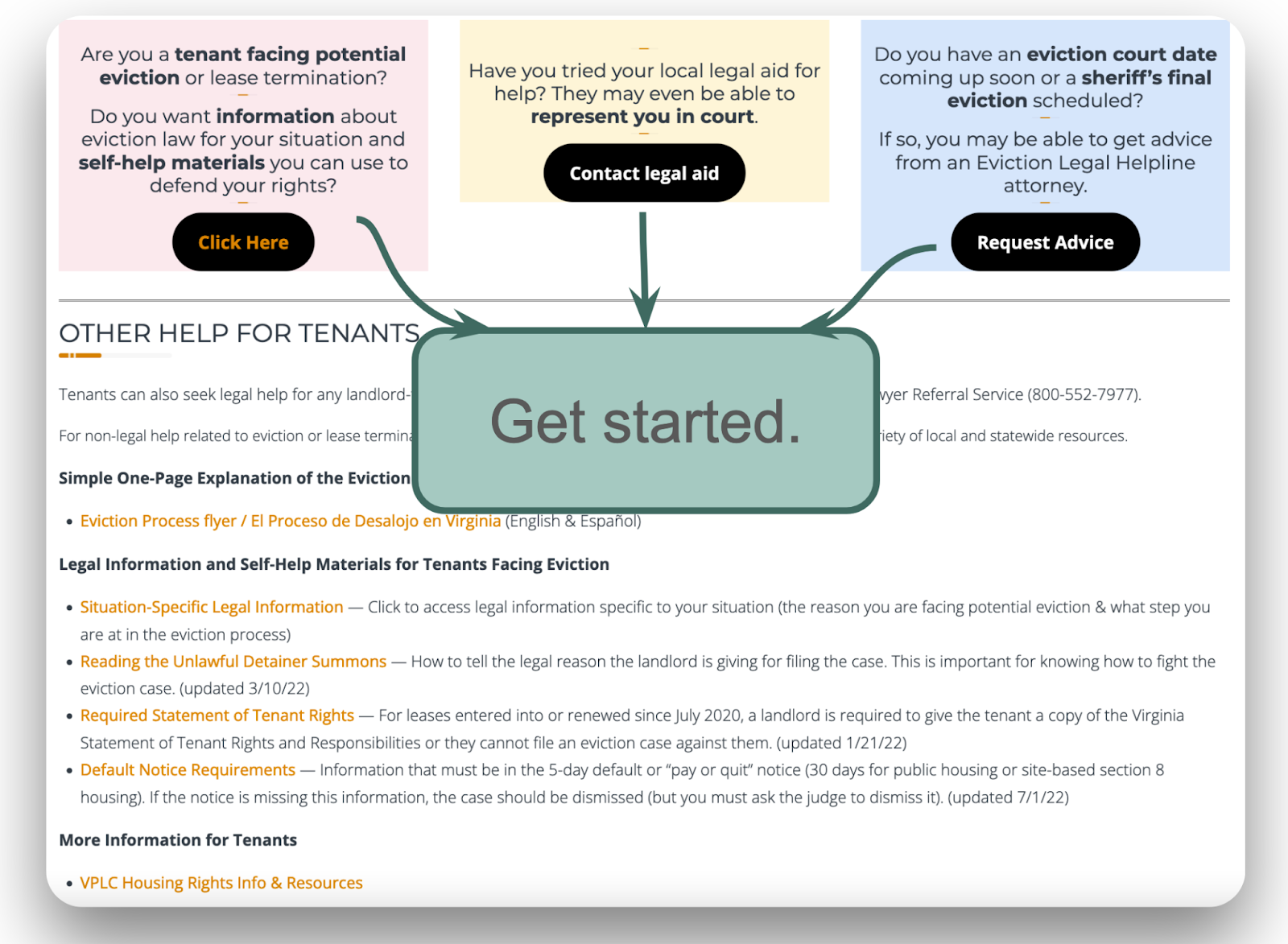
For example, on the “Tenants” homepage, several buttons and links repeat themselves, and it’s not easy to scan and understand the information. It would be useful to consolidate identical resources in a single location or prompt, such as a large “Start” button, which would then direct users to the questionnaire and, subsequently, the information they need.
Simplified example: :
Another option is to simplify buttons by eliminating extra text. Simplified example
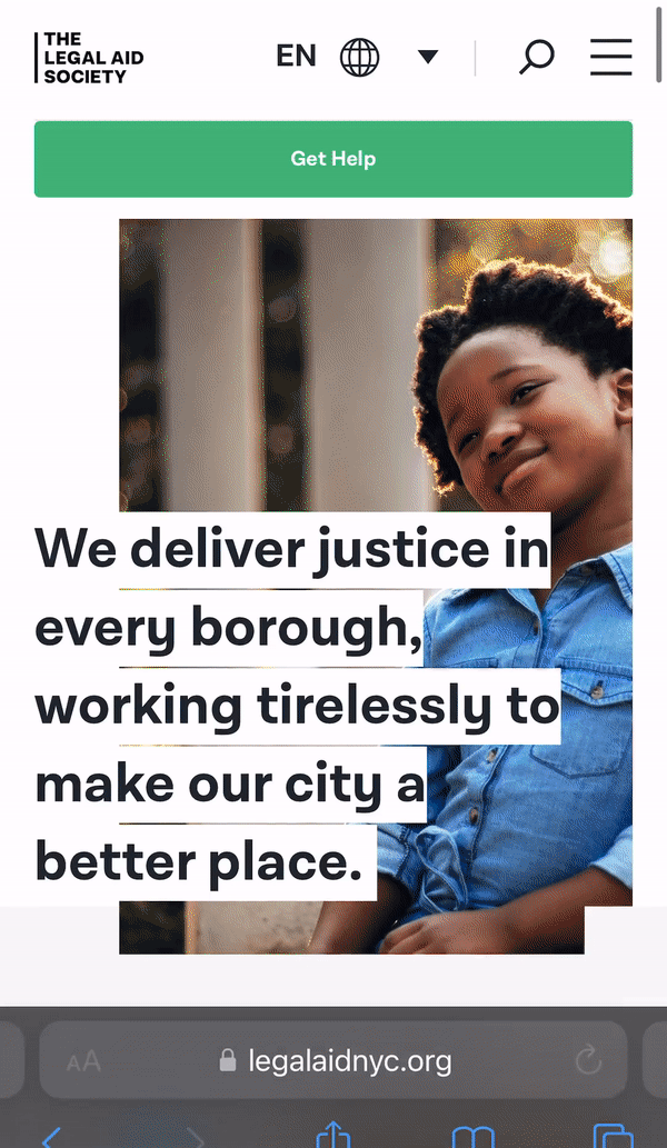
We recommend the following websites with great mobile formats as models and inspiration.
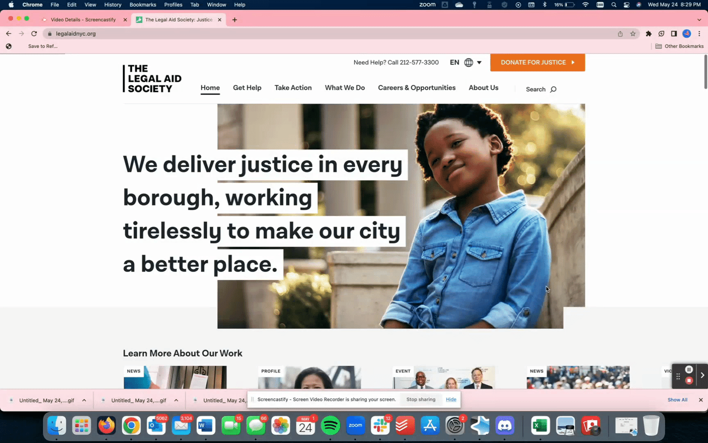
The Legal Aid Society is a great example that facilitates easy scanning with large font and bolding. It also has welcoming and well-formatted photos and a comprehensive drop-down menu for easy navigation to information.
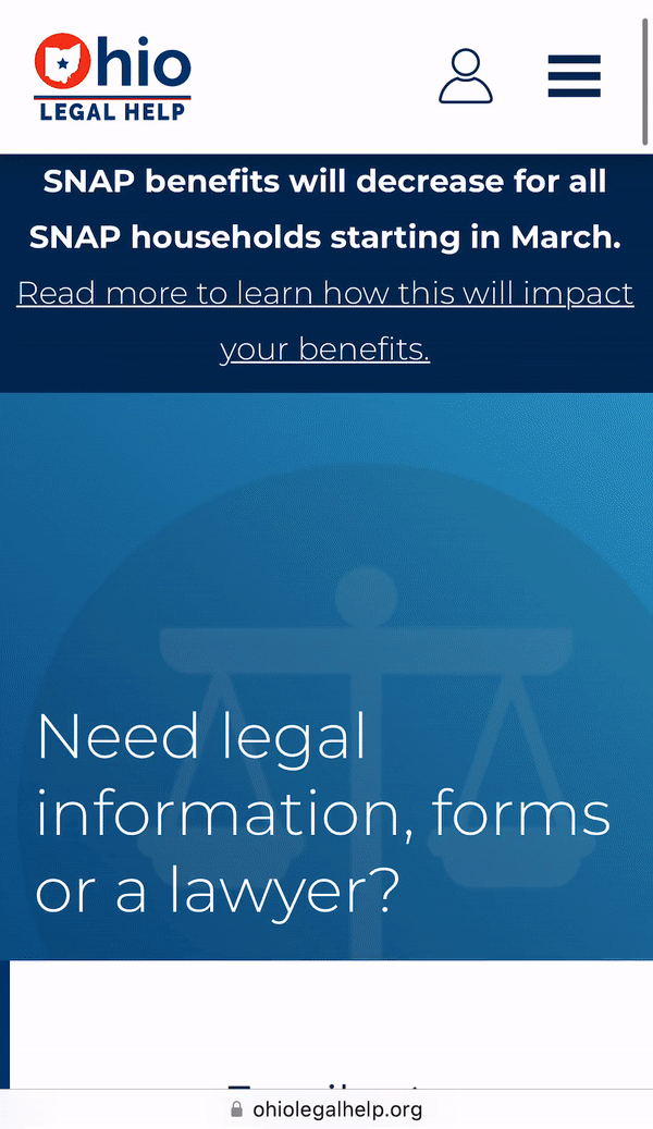
One way to limit potential overwhelm is exemplified by the Ohio Legal Help website, which relies on boxes and buttons more than a sidebar with links. There are a lot of resources & information, but the site uses icons and accessible fonts to facilitate easy scanning and navigation. One downside of this website to consider is the large number of options and buttons which could be overwhelming. In addition, there is still a large amount of text on some pages.
Considering the models from the Legal Aid Society and Ohio Legal Help, we conclude that a balance must be struck when designing mobile formats between providing detailed information and ensuring accessibility. Both the side bar and the centralized homepage with lots of buttons are good options, but the organization must weigh the pros and cons.
Redesign & rebrand the triage Decision Tree Quiz
The quiz feature on the website currently uses a multiple-choice format that may be confusing to some users. The many options may be overwhelming. During our research, we found that some users were not sure which category they belonged in, or felt that they could fit into more than one category.
This sometimes created a sense that they might have chosen the “wrong” option and may miss out on important information that could apply to them.
We suggest remodeling the quiz to a binary format to simplify the amount of information contained in each question to ensure that users arrive at the most pertinent and accurate information for their particular situation. This will also increase the user’s confidence in the information they ultimately receive.
One-Page Legal Process Summary
During our research we found that one of the most popular features on the website is the one-page summary of the eviction process in Virginia. Users liked the flowchart format and felt the information in this summary would be extremely helpful to them if they were facing eviction or experiencing housing issues.
However, most users did not find this resource without being directed to it, since the link is quite small and located near the bottom of the “Tenants” page. We recommend featuring this resource more prominently on the site. We suggest including the flowchart as an image directly on the site (rather than linking to a PDF) and presenting it to users along with the information they receive at the end of the quiz.
Having a “birds-eye view” of the entire eviction process can reassure a user who is uncertain and anxious about their housing situation, deepening their understanding of their legal rights and giving them greater agency to advocate for themselves throughout the eviction process. It may also be helpful to update the flowchart to break down the steps into groups and orient the user to key events (pre-court/post-court, service of documents, etc.).
Outreach & Discovery of the site
Having discussed formatting modifications to increase accessibility and navigability, attention must also be paid to methods of outreach. More specifically, we recommend undertaking SEO methodology in order to maximize website search traffic from interested users. Semrush, an American company that specializes in generating and distilling search engine analytics, was the primary tool used to furnish the information that we have compiled in the following portion of this report.
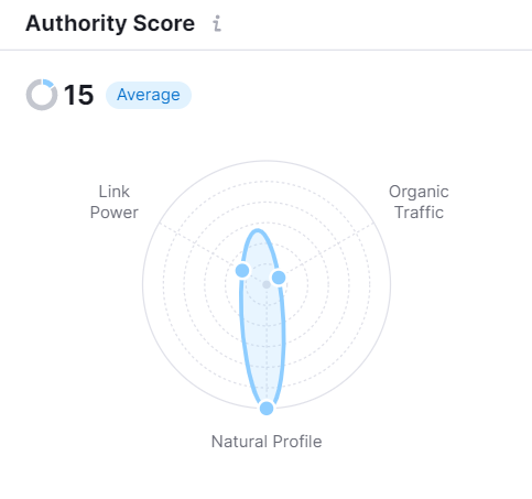
Authority Score
The first metric used to pinpoint areas of improvement was that of the authority score, visualized here in a polar chart.
The two lowest metrics here are ‘organic traffic’, which is low, and ‘link power,’ which also is concerning.
The ‘link power’ factor is primarily a measure of the number of relevant backlinks, i.e. the amount of other credible websites that link back to VPLC’s Eviction Helpline website. A higher number of backlinks to the site would increase the site’s ranking and placement on a search results page, thus boosting user discovery and engagement.
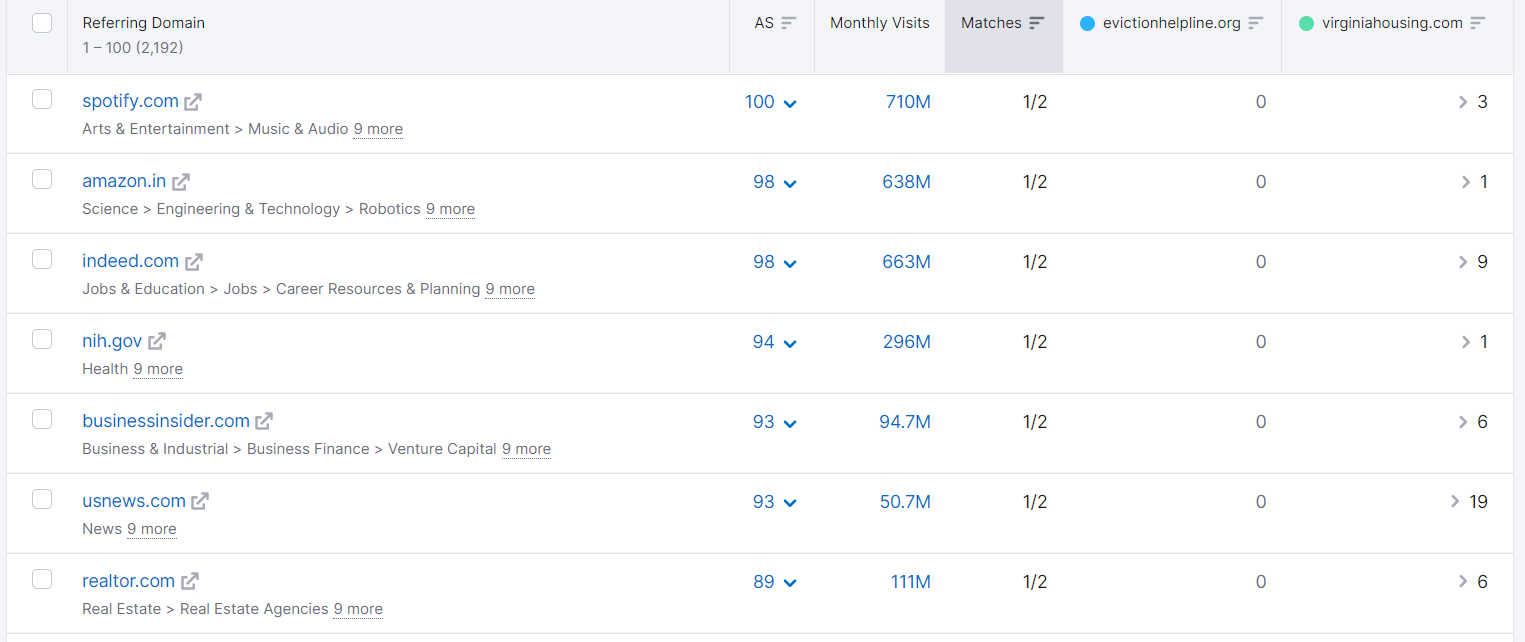
Upon generating a list of competitor sites with similar backlink profiles to the Eviction Helpline site, the only competitor to appear was virginiahousing.com.
This was thus the best option to serve as a benchmark. We compared what domains refer to this site, to see what backlinks & referrals the site is missing out on.
As the above report makes clear, several high-quality websites with significant user traffic – such as Spotify, Amazon, Indeed, and US News – contain links to virginiahousing.com but not to evictionhelpline.org.
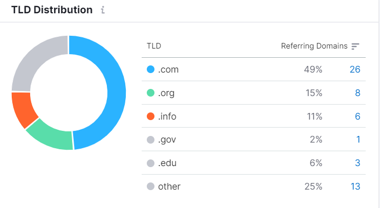
Backlinks & referral strategy
Thus, we recommend that these particular sites be targeted, to the extent and capacity possible, to advertise the site or disseminate related information. The term “top-level domain” describes the ending portion of a URL, such as dot com, dot gov, etc. The top-level domain report Semrush generated, as shown below, underlines that the majority of websites that backlinked to the competitor were dot com websites.
Emphasizing the dot gov and dot edu websites when choosing referral domains may be a useful strategy to take advantage of the increased credibility that customers tacitly assign to these top-level domains.
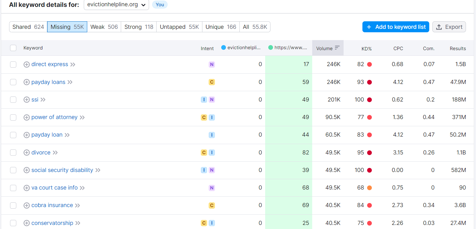
Keyword boosting
With the ‘link power’ factor addressed, our next recommendation aims to improve organic traffic through localized keyword boosting.
Although not all of the following keywords are necessarily applicable to the Eviction Helpline, emphasizing or increasing the frequency of the relevant ones would also serve to increase engagement with users. The website’s page titles, section headings, and text can all use the keywords that people are searching for. This will help the search engines know that this website matches people’s needs.
Below is an example of a keyword report the team could utilize, to find keywords that might apply to the website’s content.
Leases, Notices, and other official referrals
Another way to boost outreach is through court/government referrals and lease disclosures.
The Eviction Helpline is already featured on some government websites, such as va.gov and the Fairfax County website. However, some of the information is outdated.
We recommend updating the information on these websites to reflect the current nature of the service and making sure that any links to the Eviction Helpline lead to the correct site (these “backlinks” will also help increase SEO authority). It may also be helpful to reach out to other local websites, such as city and county websites, to include information on the Eviction Helpline.
This will boost community awareness and give VPLC greater visibility.
Court and Government Agency Referrals
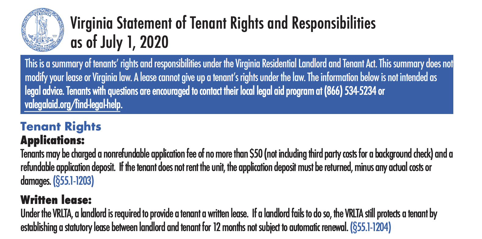
Other places to feature the Eviction Helpline include Virginia’s court self-help website and the Virginia Statement of Tenant Rights and Responsibilities.
Can the Helpline be featured prominently on this official document, with the website URL, phone, and QR code?
These community websites/resources present opportunities to “triage” target users to the Eviction Helpline site. This could potentially be automatic based on the information users input (e.g., income level, issue, etc.).
Summary
The Eviction Legal Helpline is an important resource for tenants in Virginia facing eviction and a valuable project of the Virginia Poverty Law Center.
As a public-facing website, this service must balance its function as a repository of the available information and connections with visitor engagement in order to build the trust and authority to provide them. At the same time, it is important to avoid overwhelming or confusing users with misdirected or excessive content.
In order to achieve these at-times competing objectives, the website can be improved by some adjustments, depending on available resources and interest.
Following our own learning and research as part of the Justice By Design policy lab course at Stanford Law School, we have formulated the above recommendations to aid in this effort. We hope that they may help in upgrading the site to ensure that it continues to provide valuable aid to its vulnerable target populations, and that the Helpline can maintain and expand its reach.
The more other websites that link to you — especially government or educational ones — the higher your website will climb on search results.
This is called a ‘backlink’ strategy. Search engines look to the web of who is linking to who to determine which sites are valuable, relevant, and authoritative. If a website ending with a domain like .gov, .org, or .edu is linking to a legal help website, these ‘backlinks’ make search engines more confident that your site is worthwhile & authoritative.
To that end, we encourage legal help website administrators to spend some time crafting a local Backlinks Initiative, to get more robust links among authoritative government and educational institutions.
Our cohort members had advice on how to make an effective backlinks strategy in the public interest space:
Backlinks Strategy for Legal Help Website
Identify Your Regional Ecosystem of Legal-Related Websites. Who are the websites that are helping people with issues related to legal and court issues? You can map who is providing services generally, and also run some Google Searches to see what is showing up for people online. Some of the common actors in a local ecosystem will be:
Governor’s office
Mayor and/or City Council
Attorney General, particularly the consumer protection division
Legal aid providers
Court main website
Court self-help/ ‘for the public’ website
Housing agency
Consumer protection agency/division
County law librarians
Law school librarians
Law school clinics
Local news outlets
Reach out to the Leaders & Web Team for each of these organizations.This could be an email or a call to the organization, in order to
Introduce your legal help website & your team
Ask if their team might be willing to link to your overall website, or even to specific pages within your website that might help their websites’ visitors
Offer a link exchange, where you would post their website for your visitors who might benefit from their services
Offer pre-formatted text or code that they can use right away. You can borrow from the text our Lab has already written that lists out & explains the legal help websites in each state.
Hopefully the teams will be responsive, and you can work with them to get the links set up. Ideally, they will not just be posting a link to your site, but also including text to describe it & its value to their visitors.
Here are some of the strategies & experiences that our cohort members reflected on about backlinks:
Do it early, but alsorefresh later on: Many websites do a backlink outreach campaign when they just launch. But it’s important to refresh both your landscape analysis & your outreach to get more links every year. Check in on where else people in your jurisdiction might be visiting, and approach these sites to link to you.
Be aware that some links may cause trouble: Your website might do a link exchange, where you are linking out to the organizations that link to you. Usually this is a net positive, when it comes to increasing your apparent authority to search engines. Sometimes, though, court or legal aid websites may have security flaws — like invalid security protocols — that makes search engines distrust them. If your site is connected to this site, the search engine might lower your rank. You can try to reach out to these sites to help them improve their security features, so this problem is resolved.
If you update your site, be sure to keep your previous URLs. If you are going through a site overhaul, especially when you are transitioning to new URLs for your content, you don’t want to lose out on all the incoming links you may already have. There might be lots of sites that are linking to your old URLs. That both drives users to your site, and it increases your authority to search engines. If you keep your old URLs intact, but then redirect through 301s to the new content/URL, you can preserve this authority & ensure that the old links don’t break.
You can also ask other sites to include your logo, and can give them pre-made code to help them do this easily.
Some possible partners, especially courts, might ask to see if your website is ‘unbiased’ and has resources for both sides of a conflict. They may only be willing to link to your site if it can demonstrate this lack of bias. Not all courts will have this requirement, but it is worth preparing for.
Getting links up can be slow, but if you are persistent, you can find the right person on the team who controls the website & then work with them to get it online.
Keep track on your data analytics! Can you confirm when the backlinks were put onto the site? Watch to see if your visitors or rank change in Google Analytics or Search Console. Then you can communicate back improvements to the partners, reaffirming the value of the backlinks & also decide where else you might do more links.
Prepare the right links for the right partner. For some backlink partners, you might just want their visitors to come to your homepage. This might be true for someone coming from a library or a general legal aid page. But if the backlink partner might have someone with a particular issue — like it’s likely the visitor has a debt, employment, landlord-tenant, or family law issue — you can ask if the partner will link to specific guides, FAQs, or media for this issue. That way the link could be more relevant to the visitor — so they go straight to the most helpful resource without having to navigate your site.
Our team at Stanford Legal Design Lab collaborated with a court, help center team, and community stakeholders in Cincinnati to build an eviction help webpage.
In this video, you can see a walkthrough of the choices we made to make the site as successful as possible in being discoverable, engaging, and usable to tenants and landlords.
How can more legal help providers get more of their information & guidance into more languages?
There is a giant language access problem in legal services. So many people who need help have issues with Limited English Proficiency (LEP). Ideally, people with LEP would have equal access to legal help articles, guides, FAQs, and services in their own native languages.
But there is not enough funding, staffing, and capacity to provide robust information & services in all languages needed. Especially since each jurisdiction or organization is having to do language access on their own — it becomes a huge budget & capacity issue.
They outline various tech strategies that could increase this capacity to serve in multiple languages:
Machine Translation (like a variation of Google Translate or Microsoft Translate), in which a computer program is receiving the text, and proposing the translation. There can also be human review of the Machine Translate.
Human Translation, in which a person is proposing the translation based on their knowledge of language & the situation. This is the traditional way that language access is done. An organization hires a translation firm or interpreter to provide customized, one-off translations.
Translation Memory, in which people record their translations into a database, and then when there is a new text to be translated — they draw on this existing database for the translation. This database could be private (held by a private company or group of translators, and thus cost money to access) or open-source (held by the community and shared without cost).
This third category — of a shared database of translations and glossaries — could be a powerful solution to get to scaled, accurate language access. What if legal aid groups & legal help websites shared their multi-lingual (and plain language) translations of paragraphs, sentences, phrases, and words?
If there was a collective, open-source effort to create a Translation Memory database, this could spread the costs out among many groups. Instead of each group translating their content, they could share their past translations and allow other groups to draw from this.
This can also avoid the potential harms of a machine translation solution. In that setup, the providers are hoping that the machine (and its algorithms) can provide accurate & understandable translations. They might have a human to help review this. But the Translation Memory approach prioritizes the expert human translation from the start and then uses technology to make that approved, hand-crafted translation more accessible and replicable.
The authors of the report highlight that this shared Translation Memory approach could be valuable but costly. Here are some of their recommendations:
“The amount of time and effort that needs to be put into developing and maintaining a high-quality glossary and translation memory is non-trivial. We recommend that the Legal Services Corporation convene a group of leaders from legal services providers, plain language experts, and court leaders to adopt or discard this approach.” (page 23 of report)
They also recommend gathering a similar group of stakeholders to explore what is ethically & technically possible with combining machine translation with human review or specialized legal glossaries. Could there be an effective way to build on top of Google Translate or Microsoft Translate? It would be important to have a group of stakeholders and expert reviewers decide if this is possible and ethical.
For either a Translation Memory or Machine Translate + Human Review approach, having a shared database of glossaries is a key step. Our team at Legal Design Lab has started gathering glossaries that already exist, to start building an open-source database of legal help-oriented translations.
Please feel free to write or share if you want to work on this project with us! We hope to push language access forward with this infrastructure work, that can lay the groundwork for more accessible and scalable legal help efforts.
Especially with COVID-19 hardships, there are more renters at risk of being evicted. They’re behind on rent, they’re in an unstable economy, and they need help dealing with back-rent, fees, court cases, and the threat of homelessness.
City, state, and federal government agencies have responded with new programs. There are mediation services, legal counsel programs, rental assistance funds, navigator services, and other things — often called an ‘eviction diversion’ program.
This work has brought up the question of burdens. Especially for tenants, who are having financial hardships, many of these eviction diversion programs require tenants to do lots of things to get access to benefits.
To get rental relief, for example, it means a tenant must fill in lengthy applications, gather documents, following months-long procedures, negotiate with their landlord, and figure out eligibility formulas.
This goes back to the issue: how do we design the programs in practice — not just the overarching policies? The devil is in the details. The process often is a punishment. How do we roll out relief programs that actually achieve their intent of keeping people housed, avoiding adversarial court proceedings, and stopping harmful scarlet ‘E’ eviction judgments on people’s records? How do we make sure the programs stop spirals into poverty?
This takes us back to the question about administrative burdens. If a policy is rolled out in a high-burden way, that makes it difficult to: find out about the program, sign up for it, and follow through on it. Then many times the policy goal will be undermined. People won’t be able to use the benefit, they won’t be able to exercise their rights, and the bad outcome is going to happen anyway.
Below are some key points to take away from the Administrative Burden book— though I recommend you get a copy for yourself to dive into case studies of various government and state benefits programs, and how they’ve grappled with the politics and administration of administrative burdens.
We need to focus on citizens’ experience of government policies & programs.
The book points out that policy-making often focuses too much on the policies in the abstract and does not focus on their actual administration. There’s too much focus on the policyholder or the policymaker, and not so much on the citizen’s experience
More burdens are faced by those who have fewer resources to manage and overcome them. For many Americans, the experience of government is the experience of burden (see p. 7 of their book).
There are 3 main categories of burdens to track: Learning, Psychological, and Compliance Burdens.
We can measure how high- or low-burden a program is by looking at 3 components of a citizen’s experience:
Learning costs:
Time to learn about the program
Time to figure out if you’re eligible for it
Time to figure out what benefits you’d actually get
Time to access the program
Time to determine what conditions you need to satisfy to get it
Compliance costs:
How hard it is to assemble documents to prove you’re eligible, or what you should get
Financial and transactional costs to get services to help you get through the application — like lawyers or navigators
Travel costs to show up for interviews, file documents, get other supporting documents or fingerprints
Financial costs of fees to apply or get documents
Transactional costs to reply to communications from the program, meet deadlines, clarify requests
Psychological costs:
Overcoming stigma or embarrassment of using a service
Losing autonomy and privacy when opening one’s life to administrators evaluating them
Frustration of dealing with repetitive, unjust, and unnecessary procedures
Stress about the uncertainty of whether one can make it through the process
Sense of procedural injustice, of not having a transparent, respectful, and fair procedure
Some of these costs can be measured objectively, by gathering data about financial costs, time costs, and other quantitative measures. Others can be measured through surveys, interviews, and other design evaluations of people’s experiences.
Burdens matter to people’s use of government programs.
Burdens matter a lot. As policies and programs put more burdens on people, this affects whether people can actually get the benefits and rights that are at the heart of these policies.
And design matters to burden. This is a matter of user experience, good design, and community involvement. Good, community-centered, and creative design can shift burdens away from citizens and on to the government. How can we shift burdens to those with more resources to bear them? That’s most often away from citizens individually.
Design can help us measure burdens as we are creating new programs and services, and then evaluate them in their pilot stages. Are people being frustrated? Are they dropping out from onerous tasks? Are they becoming alienated from government services because of how burdensome a program is? We can use design techniques of user testing, UX evaluations, and human-centered evaluation to measure these burdens and create new strategies to repair them.
Every public service should have good citizen experience (and burden reduction) at its core.
As groups are making and evaluating new programs, they should be aware of citizens’ experiences and burdens. This means having these principles at the core of their work:
The program should be designed to be simple
Processes should be as accessible as possible
The program should be respectful of the people they encounter, and dignity should be at the core
Design can again help here. This can be done through User Personas, User Journey Maps, trackers of where people are failing or falling off, surveys about stress and procedural justice, and measurements of wait times and other objective measures of burdens.
We can create replicable strategies to lessen burdens and improve citizens’ experience.
How do we make Administrative Burdens & Citizen’s Experience part of front-line policymaking and service delivery?
The book points to a few directions:
Training policy managers & on-the-ground administrators in the importance of the citizens’ experience, these 3 kinds of burdens, and the importance of good service design. There also needs to be explicit training in equity & burdens — about whether people from certain demographic groups are being asked for more evidence, put through more process, and asked to shoulder more burdens.
Instituting more testing of burdens before and after a program rolls out. If we measure it, we’ll optimize for it. This means gathering data on the learning, compliance, and psychological costs — -through intentional data-tracking, running of surveys, mapping of user experiences and drop-offs, etc.
Deploying burden-reducing strategies that can reduce these learning, compliance, and psychological costs. Some of these burden-reducing strategies include the following. Many of them draw on nudge/behavioral heuristics literature.
Burden-reducing strategies for public programs
Limit eligibility criteria. Cut out unnecessary or overly burdensome ‘means tests’ that make people prove they are eligible based on various income and financial assessments
Limit the amount of choices, reduce cognitive demands, and label what the most common choice is.
Invest in community-based outreach, to make it easier to find out about the program and learn other people’s stories of it.
Label and brand programs in positive terms, that reduce stigma, embarrassment, and moralizing.
Auto-enroll people, presume they are eligible and cut out tasks they must do to get access to the program.
Figure out which party is well-resourced, and pass high-burden tasks around document uploads and financial accounting to them.
Possibly do cross-overs between programs, integrating data from other programs so there’s no need to fill in forms with information the government already has, or upload new documentation.
Open Question: does lowering burdens on citizens mean trading off privacy?
One question to balance the burden discussion with is around people’s privacy, and control over their own data. Many strategies around lowering burdens mean collecting and connecting data together.
Especially if it is poorer people applying for these programs and needing ‘burden-reduction strategies’ — it’s likely to be their data that is being handed off between programs in order to make it easier and quicker to use a service.
Does reducing burdens lead to a reduction in privacy from the government? What is the balance between an all-knowing government, in which agencies are passing off information about a person back and forth — and an easy-to-use government that is significantly easier to access? There’s a huge need for design sessions, technical solutions, and policy work around this trade-off, of low-burden government services that also protect vulnerable people’s privacy.
Last night at my Public Interest Tech Case Studies class, our guest speaker was Dr. Tina Hernandez-Boussard of Stanford School of Medicine. She is a multi-hyphenate: doctor, epidemiologist, and researcher who works on how AI algorithms are being developed and deployed in health care. One of her lines of work is looking at whether the AI applications being deployed in medical work are not only technically robust, but also ethical, human-centered, and socially just.
The promise of AI in medicine is huge: if researchers, machine learning experts, and clinicians can draw on all of the past data of patients, symptoms, treatments, and outcomes — they may be able to offer better, quicker, more intelligent help to people who are struggling with illness.
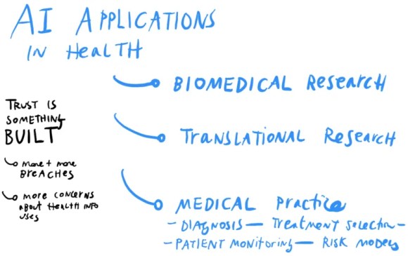
Dr. Hernandez-Boussard identified 3 main tracks that medical professionals are using AI for. These may be analogous to legal tracks that are beginning, or may begin soon, for legal help & AI. They are:
improving biomedical research (like in surfacing important findings from researchers, and links between studies),
doing translational research (like in how the genome affects diseases and outcomes), and
improving medical practice (like in how diseases are diagnosed, treatments are selected, patients are monitored, and risk models of disease/outcomes are built)
What potential is there for AI for Access to Justice?
This third track is perhaps the most exciting one for those of us focused on access to justice. What if we could better spot people’s problems (diagnose them), figure out what path of legal action is best for them (treat them, or have them treat themselves), and determine if their disputes are resolved (monitor them)?
Our Legal Design Lab work with Suffolk LIT Lab is already working the first thread, of spotting people’s problems through AI. We had collaborated on building Learned Hands, to train machine learning models to identify legal issues in people’s social media posts. That’s led to Suffolk LIT Lab’s SPOT classifier, that is getting increasingly accurate in spotting people’s issues from their sentences or paragraphs of text.
This medical scoping of clinical AI uses could inform future threads, aside from issue-spotting, for legal aid groups, courts, and other groups who serve the public:
Legal Treatment AI: Can we build tools that predict possible outcomes for a person who is facing a few different paths, regarding how to resolve their dispute or issue? Like a tenant who is having problems with a landlord making timely repairs: should they call an inspector, file for rent escrow, try to break their lease, use a dispute resolution platform, or do nothing? What would be the time, costs, and outcomes involved with those different paths? Many times people seek out others’ stories to get to those data-points. What has happened when other people take those steps? AI might be able to supplement these stories with more quantitative data about risks and predicted outcomes.
Problem Monitoring AI: Can we build tools that follow up on a person, after they have interacted with legal aid, courts, or other government institutions? Did their problem get resolved? Did it spiral into a bigger ball of problems?
The need for community design + ethical principles in AI development
That said, with the promise of these medical-inspired threads of legal help AI — Dr. Hernandez-Boussard warned of the importance of careful design of the AI’s purpose, data sources, and roll-out.
The danger is that AI-specialists develop new algorithms simply because it is possible to do so with available data sets. They may not think through whether this new tool (and the data it’s based on) is representative of the general population and its diverse demographics. They may not think whether clinicians would actually use this algorithm — whether it solves a real problem. And they may not think about unexpected harms or unequal benefits it might result in, for the patient.
This shows up with algorithms that detect heart failure in men, but don’t work at all for women. This is because the data the algorithms were trained on, is based on trials populated mainly by white men. Their symptoms for heart attacks are markedly different from women’s symptoms. So the model doesn’t detect women’s risks accurately, and may result in women not getting the prioritized care or appropriate treatment. A similar story is developing in regard to skin cancer screenings, in which the dataset training the AI is mainly from fair-skinned patients. Thus, the tool likely won’t be as effective for screening cancer in darker-skinned patients.
AI built on non-representative data, or rolled out with too much trust in its predictions, may result in poor care, bad outcomes for unrepresented groups, and less overall trust in the health system (and the AI).
Dr. Hernandez-Boussard is working on a better framework to think through the development of AI for clinical care.
Stakeholder Involvement in scoping the AI project, setting standards, and limits
Data cleaning, quality-checking, and pre-processing — to make sure the data is as recent, accurate, representative, secure, etc. as possible
Development of tech and testing of its fairness — to make sure that it is making accurate predictions, especially across protected classes of gender, race, etc.
Rolling out the AI to be transparent and usable — so that practitioners don’t over-rely on it, use it for problems it wasn’t meant to solve, and to make it comprehensible and usable to patients and their care teams
This involves early, deep stakeholder involvement. In this phase, there are critical discussions about whether AI is needed at all, what important questions it can answer, and whether clinicians and patients would actually use it on the ground.
Legal design is also essential in the fourth phase of development: how is the AI rolled out to people on the ground who should be using it to make decisions. Do they know its limits, its standards, and its sources? How can they be sure not to over-rely on it, yet still build trust in what it is able to do? And how do they help overwhelmed patients make sense of its predictions, risk scores, and lists of percentages and possible outcomes?
Are you interested in learning more about ethical AI in healthcare, and how it might be used in other fields like legal services? Check out these upcoming events and online courses:
Its description: With artificial intelligence applications proliferating throughout the healthcare system, stakeholders are faced with both opportunities and challenges of these evolving technologies. This course explores the principles of AI deployment in healthcare and the framework used to evaluate downstream effects of AI healthcare solutions.
Its summary: Artificial intelligence has the potential to transform healthcare, driving innovations, efficiencies, and improvements in patient care. But, this powerful technology also comes with a unique set of ethical and safety challenges. So, how can AI be integrated into healthcare in a way that maximizes its potential while also protecting patient safety and privacy?
In this session faculty from the Stanford AI in Healthcare specialization will discuss the challenges and opportunities involved in bringing AI into the clinic, safely and ethically, as well as its impact on the doctor-patient relationship. They will also outline a framework for analyzing the utility of machine learning models in healthcare and will describe how the US healthcare system impacts strategies for acquiring data to power machine learning algorithms.
The COVID-10 pandemic has precipitated much national chaos and confusion with regard to the legal process of evictions. Several local governments and courts have been adjusting their policies to accommodate the current catastrophe, such as by placing temporary moratoriums on evictions or relaxing payment deadlines for tenants.
In response to this housing crisis, we have been working as part of the Stanford Legal Design Lab to build a Legal FAQs platform providing jurisdiction-specific eviction information on a local, state, and federal level. Our primary task as summer interns these past few months has involved achieving 50-state coverage on legal, easily understandable content for people facing eviction lawsuits.
Based on the skills and knowledge we have acquired while working on the eviction platform, we have written below an easy guide to creating user friendly FAQs.
1. USING SIMPLE LANGUAGE
One of the most important things to keep in mind when creating user friendly FAQs is your audience. Who are you writing this for? It’s very easy to lose ourselves in legalese or whatever technical jargon we’re familiar with, to assume that we’re all on the same page, and for our audience to be left behind. As silly and Elementary-esque as it sounds, sometimes it helps to read what you’re writing out loud. If it sounds too complicated or verbose, you know that you need to go back and edit to try to keep it simple, both in language and conceptually. Keeping the language basic and easy to understand ensures that your users, no matter their background, can always follow along.
2. KEEPING CONSISTENT WORDING
On this same line of thought, it’s important to have plain language consistency. One way to do this is by creating an overall general template that you can use for each portion of your FAQs, and then to fill in the pertinent information as you go through answering the specific questions. This way the wording will be consistent all throughout.
3. REVIEWING WITH PARTNER
Be sure to review your work. It’s a great idea to work in a team or with a partner; this way you can review each other’s work to make sure that you are both using plain language, and using a template ensures that you both are using consistent language. You can catch things your partner might have overlooked or missed and vice versa.
4. TRACKING SOURCES
Another tip for creating FAQs is to keep a list of sources as you conduct your own research. Our team worked on creating FAQs for all 50 states. Starting was very difficult — not knowing how to navigate all the legal codes and research out there made it slow going, but once you begin to recognize sources that you can use or even certain terms or phrases to search, it becomes much easier. And so keeping a list of the sources or phrases you use to research will help you as you curate FAQs.
5. REACHING OUT TO EXPERTS
It’s also extremely important to prevent people from finding the wrong information. You can do this by reaching out to volunteers, professionals in whatever field you’re creating FAQs for, and asking them to review your work and ensure the accuracy of your answers. In our case, if even one of our answers is incorrect, and people read our FAQs and think that they have more time to answer an eviction suit than they really do, it can have serious consequences. This is why it’s very important to verify your work as you go along.
FINAL WORDS:
We at the Legal Design Lab used this process to successfully develop eviction FAQs and anyone can follow this guide to create their own set of user-friendly FAQs. One of the biggest takeaways from this article is to be mindful of your audience — FAQs packed with jargon aren’t useful to anyone, so make sure to use simple language! Through these five easy steps, — using simple language, keeping wording consistent, reviewing your work, tracking your sources, and reaching out to experts, you’ll be able to create accessible and easy to understand FAQs while maintaining verified correct information.